01 Branding 02 Marketing Website 03 eCommerce Site
01 Branding 02 Marketing Website 03 eCommerce Site
OneStopShop helps the hospitality industry streamline procurement.
When you run a restaurant, every week, you need to...
...fax the fish monger for that week's fresh fish
...call your AB InBev rep for beer restock
...email the wholesale supply store for napkins
...and repeat for your 32 other vendors.
The Problem
Each vendor has their own ordering procedure—a paper form to complete and fax, a point person you call or email. Once the order is placed, tracking and visibility into your order is similarly manual, opaque, and varied by vendor.
Instead of faxing, calling, and emailing your 32 suppliers every week—OneStopShop onboards all of your suppliers onto a single eCommerce platform where you can reorder all of your supplies from one place, from the suppliers you already know and trust.
The Project
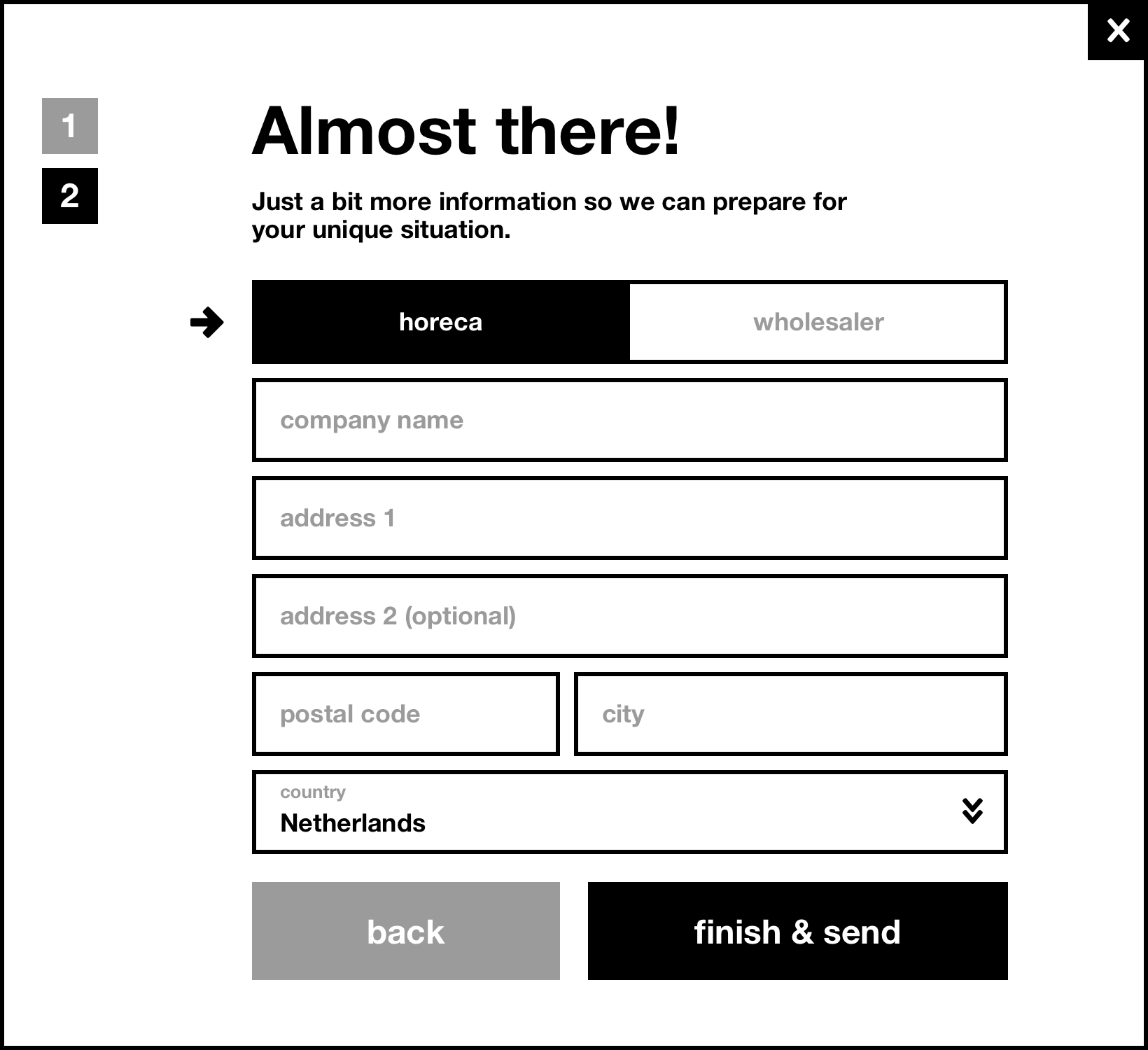
After testing and refining their value proposition and operations during a soft launch, the team at OneStopShop needed help preparing for the next stage of growth. This included:
- Develop the visual identity of the OneStopShop brand from more than a logo.
- A marketing site for both hospitality business owners (horeca) and wholesalers (their suppliers) that engenders trust.
- UX optimizations for the ecommerce experience based on learnings from launch.
01
Branding
Branding
Competition
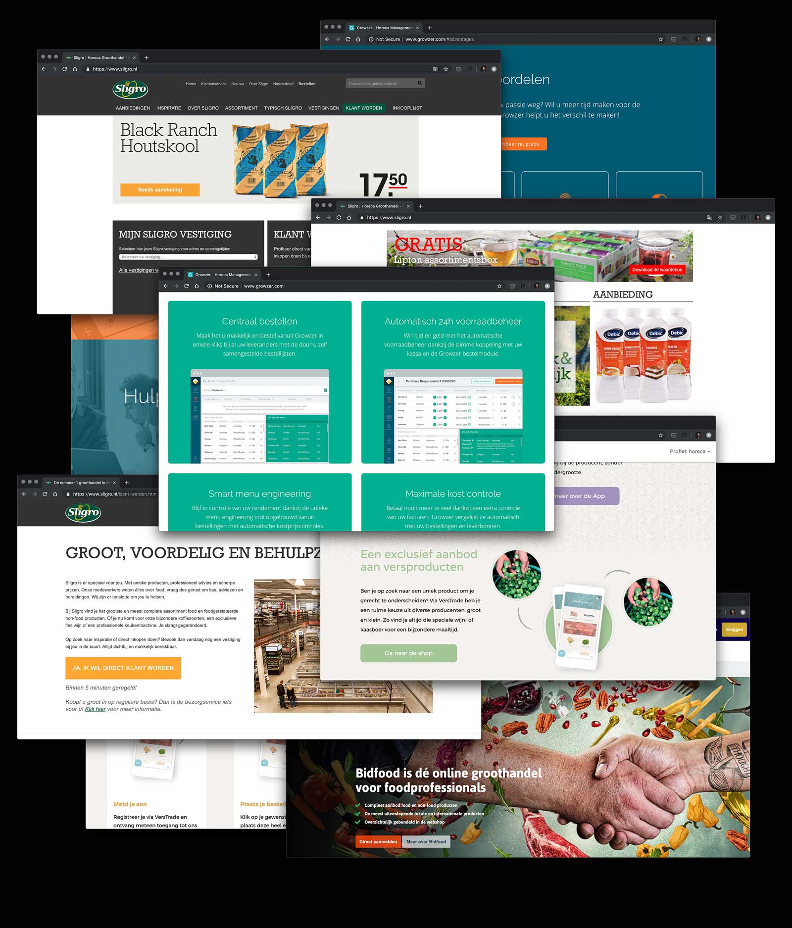
The wholesale industry is a crowded space, but every competitor was taking a similar brand approach.
As a young startup, one strategic direction is to blend in with the competition, and not rock the boat. OneStopShop would appear large, credible, and safe.
Unlike the competition (whose well-funded marketing has already touched the same set of businesses OneStopShop is targeting), OneStopShop is taking a completely different customer-centric approach.
OneStopShop isn't just meat, or alcohol, or any one category of supplies.
OneStopShop isn't a giant portal with separate carts and checkout experiences per supplier.
OneStopShop isn't trying to change the business's ordering to a completely different set of suppliers.
Blending in visually and linguistically was even more risky than blending in—in allowing our audience to fall back into the same established mental patterns for how wholesale ordering works.
If we're turning the same old process on its head, the entire brand needed to express this. Instead of telling customers OneStopShop is different, we can show them by expressing this through all aspects of the brand.
Logo ➔ Brand
The company already had a fantastic logo. The modified Helvetica is no-nonsense, strong, stable, and streamlined. Using Helvetica as the single typeface throughout the marketing and eCommerce experience served as a neutral backdrop to not distract from the workflow and content.
Done. Period.
The perfectly circular "O"s and bowls of the "p" set up the rhythm to tee up the round period at the end. A sharp way to end the name, express the get-it-done attitude, and introduce the circle as a reusable design element throughout the visual branding and UI.
So easy, a 5-year old can do it.
One goal set by the team: "how can we straddle the line between focus, simplicity, and being so primary that a child could use it, but without being literally childlike?"
The circle grocery cart icon has a wonderful childlike building block quality. Extending this into the UI, we use big words, big buttons, primary colors. Big hit areas so it's faster to get your job done, and no superfluous ornamentation to slow down load times and get in the way of your workflow.
Trimming down to the essentials.
There’s no risk of brand confusion when you’re the only brand that is confident enough to reject trendy gradients and dropshadows. The basic white/black/yellow palette serves as a backdrop so that your products get the spotlight—all the easier to identify your order.
02
Marketing Website
Marketing Website
Project goals
The site needs to accomplish three things as a critical touchpoint in the customer journey:
Problem aware / solution aware
smallest cohort
Once OneStopShop starts experimenting with paid channels, this segment of customers will grow. It will be key to connect with people in this audience by showing expertise in their industry, empathy for their pain, trust that this can deliver on the promise, and build brand salience if they're comparison shopping several solutions.
Product aware
largest cohort
Most customers coming to the site are warm leads, having just heard about OneStopShop from a rep or an industry peer. Their interest is piqued, and the site must now build trust and continue to educate customers in this stage to take the next step and try the service.
Most aware
Clear path to sign up and get started.

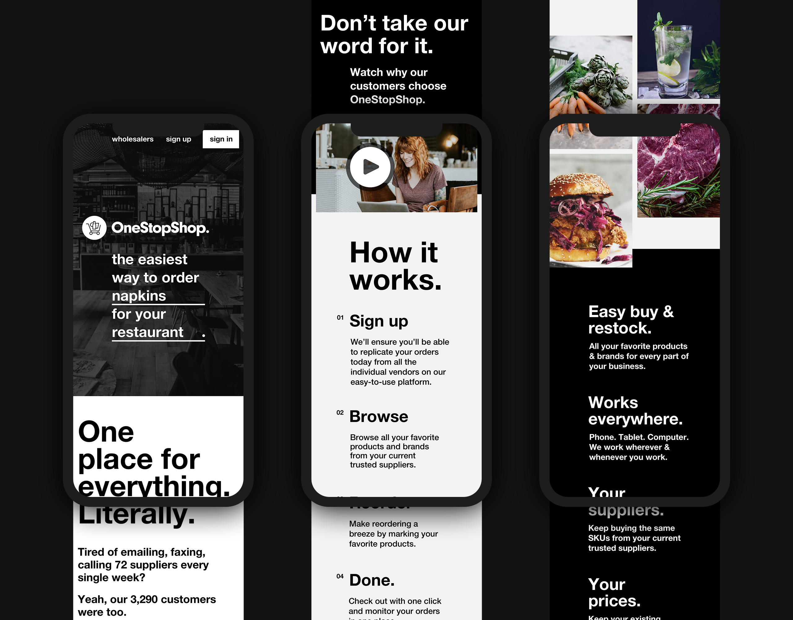
Hero
Customers often discover OneStopShop from friends who already use the service. If their buddy is currently using OSS to primarily order fish, their first introduction to the brand is that OSS is this great new fish place.
To ensure the value proposition of one place to order anything for your business doesn't get lost, the hero rotates through all of predictable (fish, produce, paper goods) and surprising things (DJs) you can order.
To ensure leads don't self-select out based on size or industry, another fill-in-the-blank rotates through all the businesses OneStopShop serves.
OneStopShop, in a nutshell
This section's job is:
- explain what OneStopShop does (one place for everything.)
- demonstrate empathy for your problem
- show it's real and trusted (3,290 customers)
- and show the conversational human side—a huge differentiator from competitors who talk like management consultants
How it works
This section runs through how the process works, addressing the most common concerns at each stage.
- Yes, you'll keep all your same vendors that you're attached to and trust
- Yes, it'll be easier than what you do today to restock
- And be off running your business, instead of calling your vendors
Reinforce the key value props
People don't read websites like a book, where they carefully read each sentence from top to bottom. Here's a at-a-glance recap of the key value props we need to get across, even though it's a bit of a repeat of the points we've made above.
Video for storytelling
And for everyone who doesn't read, here's a video that introduces OneStopShop and a diverse set of customers.
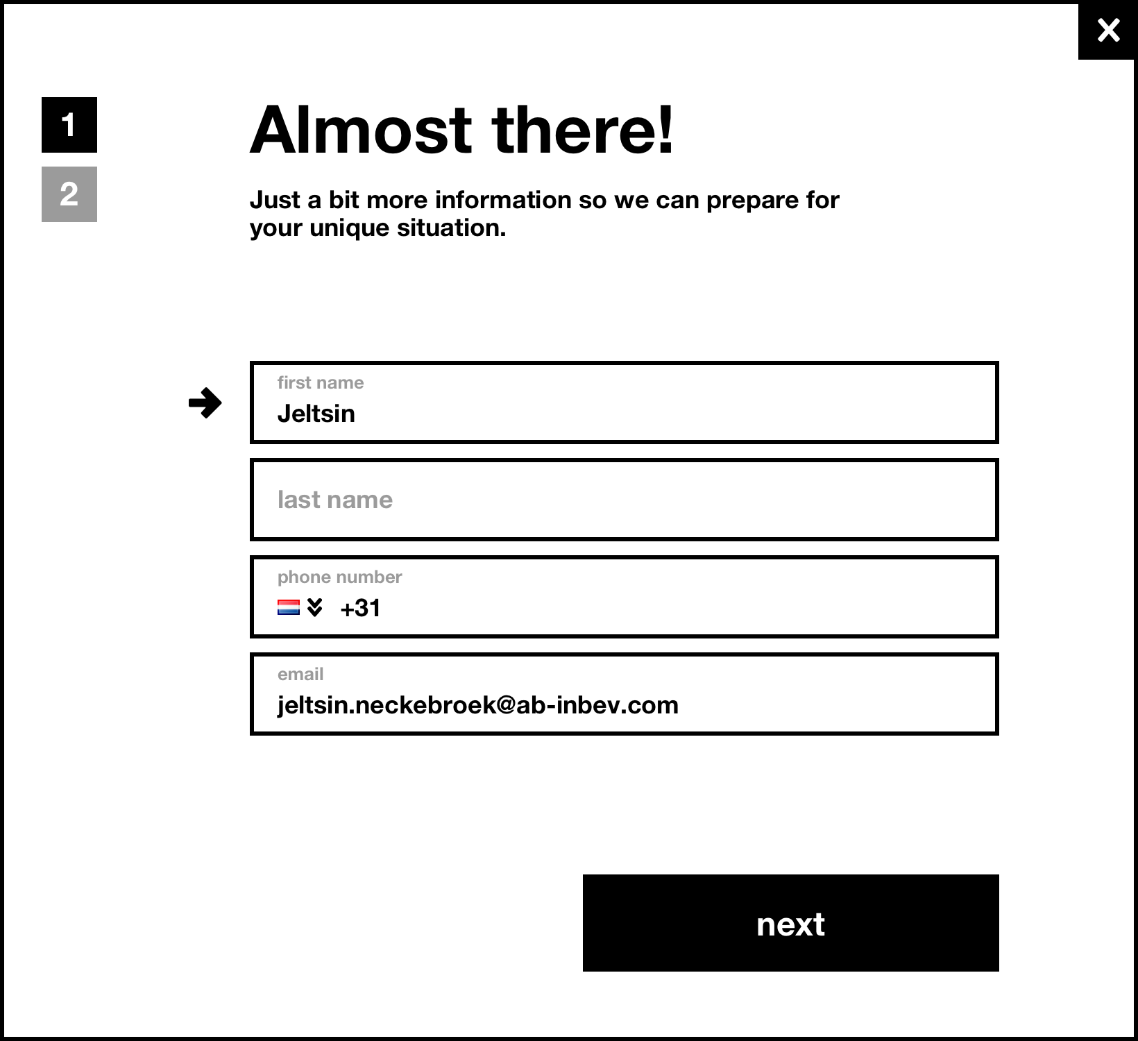
Starting the journey
Getting started is as easy and non-committal as entering your email address. Unlike other sites that have a 3-page form, OneStopShop personally onboards each customer with minimal upfront info.
Not just for kids these days
"I don't even have Facebook. But I love how easy OneStoopShop has made my life." was something the team heard over and over when talking to customers.
We wanted to emphasize this, especially since the visual branding may seem too modern.
Commitment to the customer
As a startup, OneStopShop won't have the largest team, the most vendors, or largest assortment. But they can guarantee that they'll be the most personally-committed to each customer's success.
No screenshots
What's notably missing? Screenshots of the eCommerce experience. The story we're telling isn't about the UI of the shopping website—it's about the customer getting the task done. It's not the customer's job to decipher complex screens. We focus on them getting their tasks done.
Wholesalers
When a customer joins OneStopShop, their catalogue of products and wholesalers are proactively onboarded onto the platform. This panel serves to catch wholesalers who may have arrived out of curiosity after receiving an inbound sales message from OneStopShop.
As marketing ramps up, there may be a need to fork the traffic earlier in the page, or create additional wholesaler-specific landing pages.
FAQs
Having scrolled all the way down, this section addresses any last objections or confusions they may have.
03
eCommerce Site
eCommerce Site
Project goals
Save time on replenishment
primary goal
The average order contains 30 SKUs, each session lasts 2–3 minutes, and more than half of all sessions are on mobile (usually while taking inventory in low-light basements). Most shoppers know exactly what they need, and need to accurately add the right quantities of the right products to their cart.
Exposure for vendors
secondary goal
OneStopShop lowers the barrier to discovering new vendors, products, and services. Are you getting the freshest salmon at the best possible price? Maybe it's time for your hotel to start offering guests craft beer—an upgrade from the 3 draft options you already offer.
Is there a way to surface new products and help customers browse the entire assortment offererd by OneStopShop?
Agile design & development
Working closely with the Pixelcabin team leading the agile project management and engineering, we addressed the highest-impact, lowest effort updates. There are endless wishlist UX tweaks we'd all love to make if we had unlimited resources, but with a lean team, we honed in on the most business-critical stories.
Save time on replenishment
Save time on replenishment
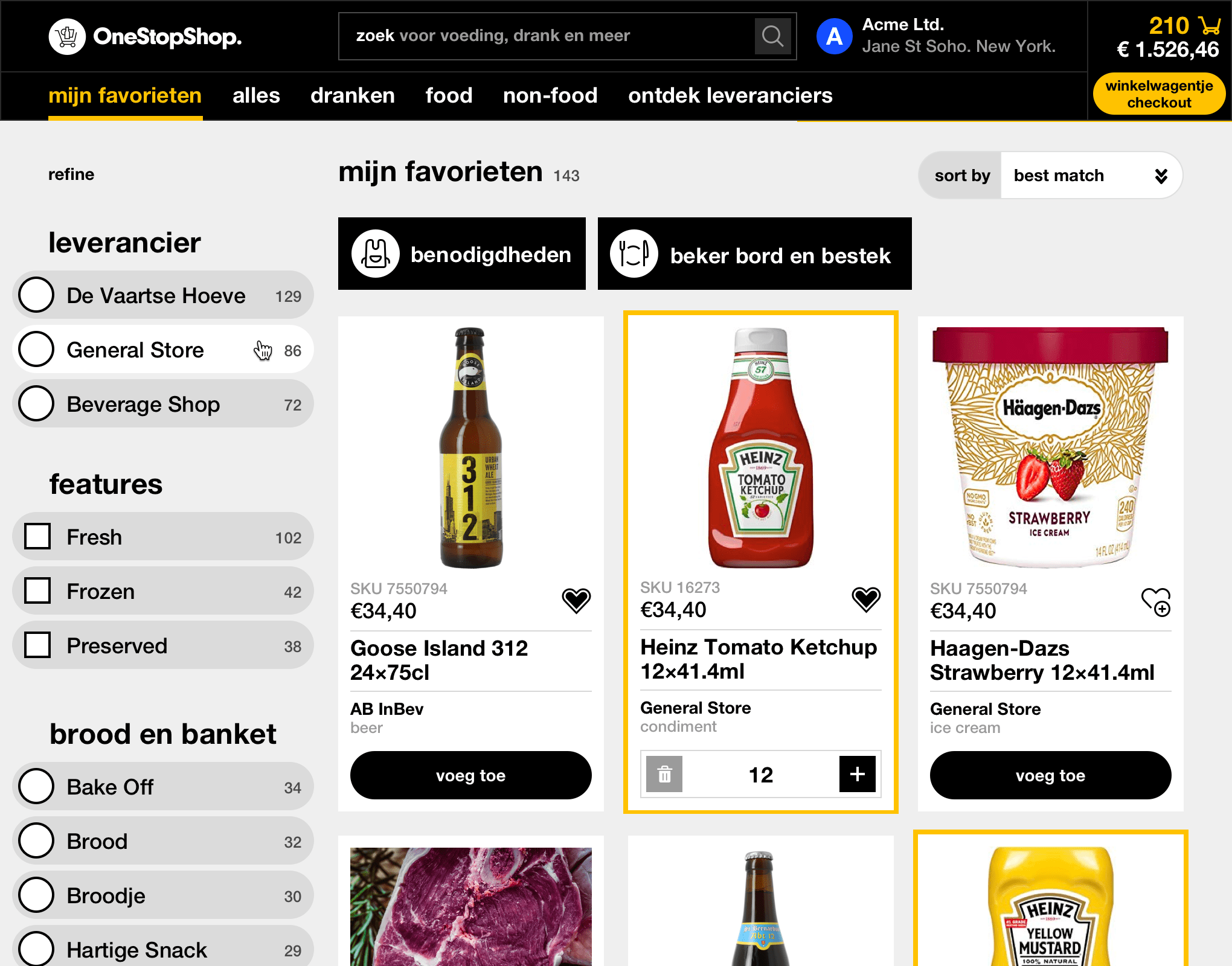
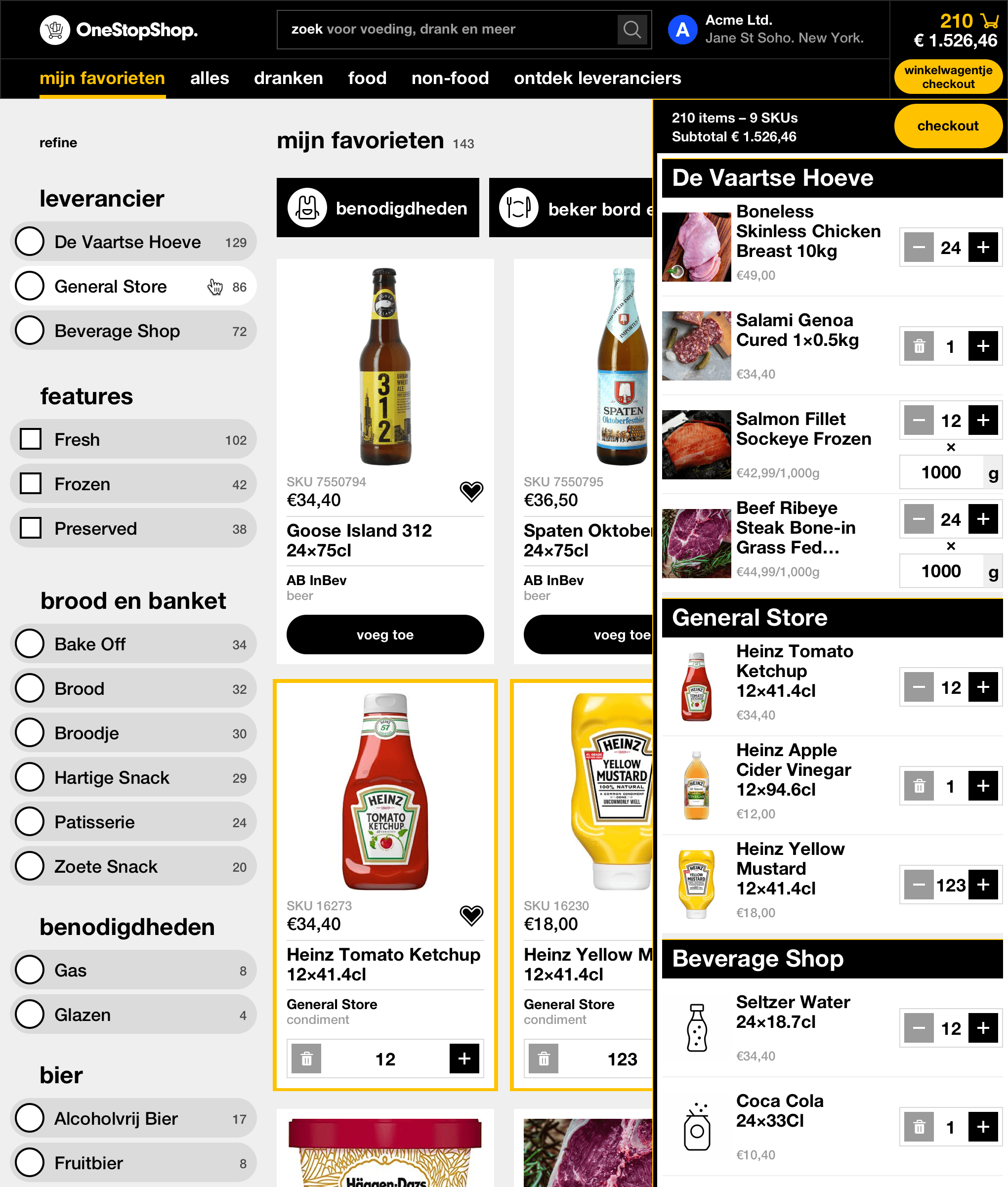
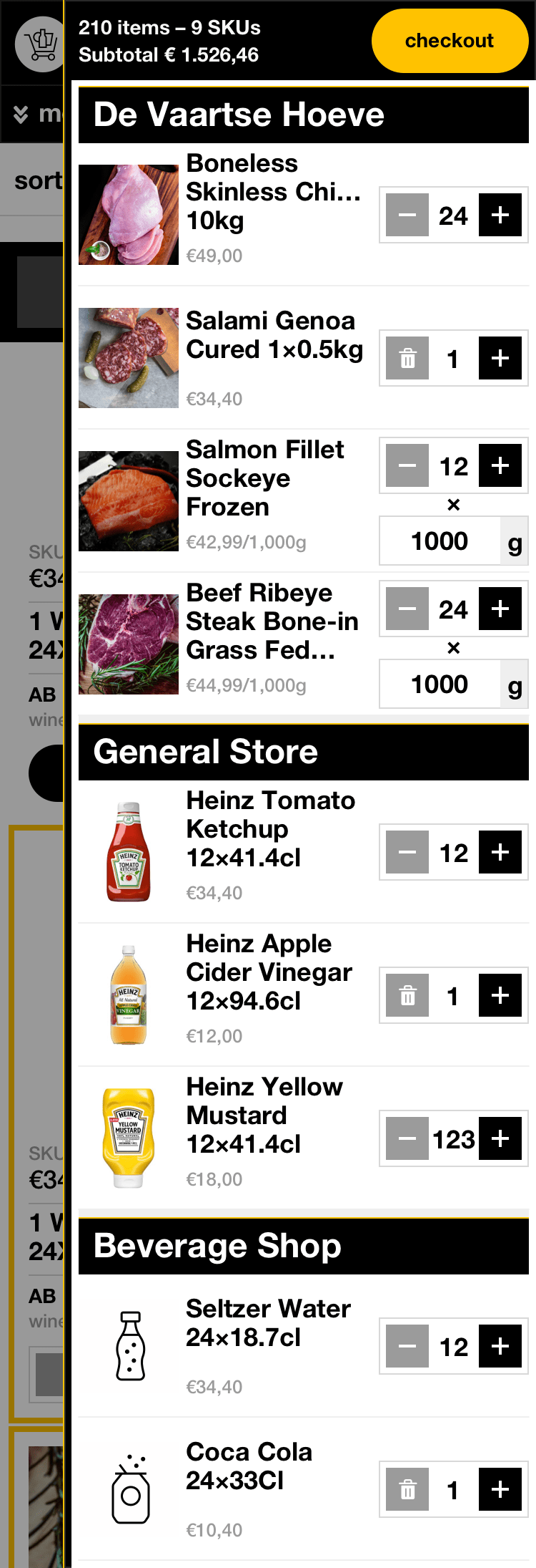
When a restaurant joins OneShopShop, the team works hard behind the scenes to onboard the restaurant's current suppliers and SKUs ordered onto the platform. These are saved as "My Favorites" and acts as an easy shortcut when the shopper needs to replenish their inventory. This is by far the most common user journey and reason to open the site.
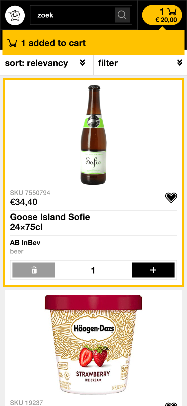
The shopping cart is a fly-out from the right, allowing the shopper to seamlessly cross-reference what's in their cart while browsing, instead of losing their place by having to go to a standalone cart page each time they need a peek. A bright yellow border highlights products already in their cart while browsing long product list pages.
Desktop
Mobile
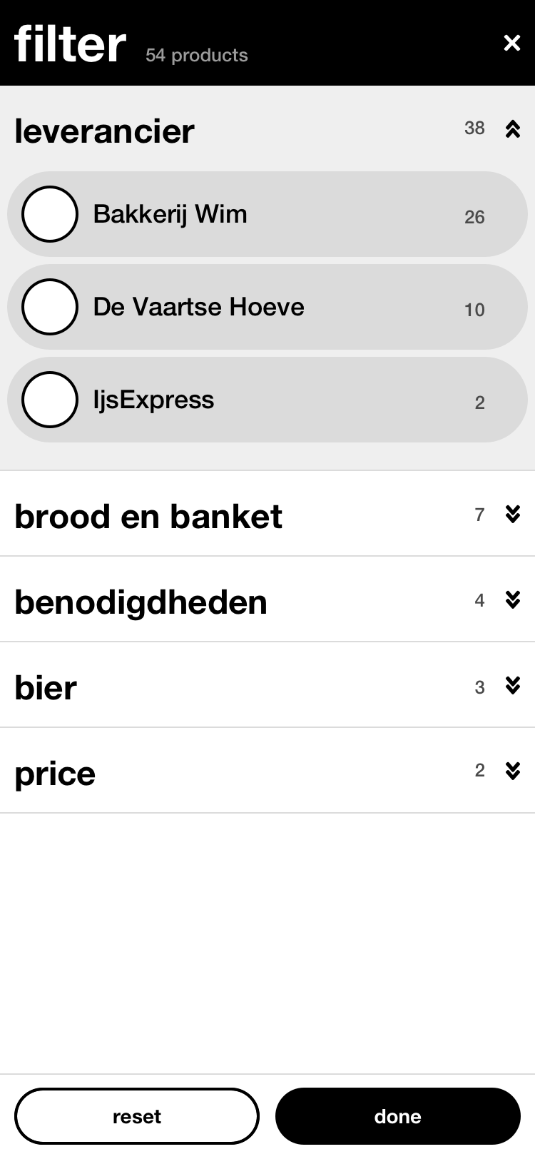
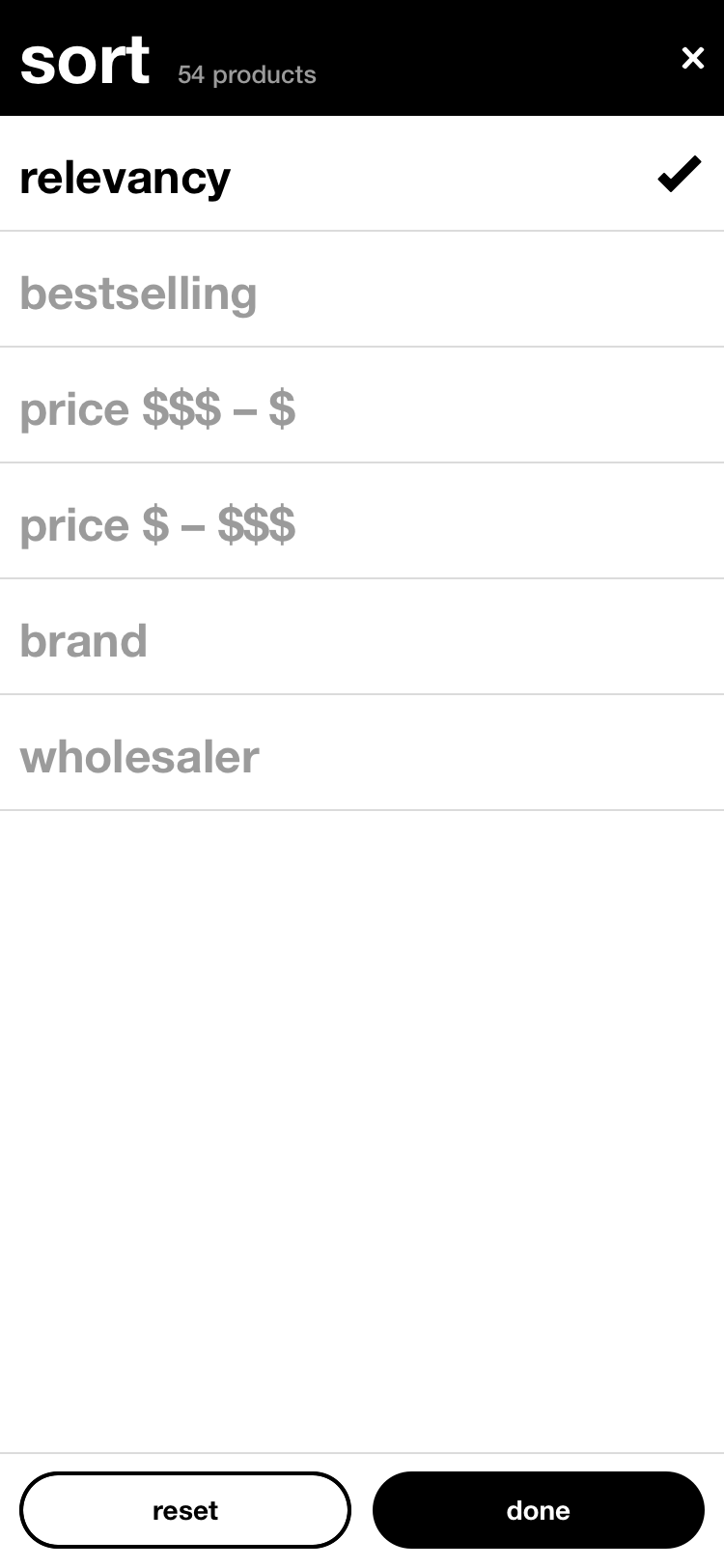
Filtering the full catalogue
Save time on replenishment
Desktop
Mobile
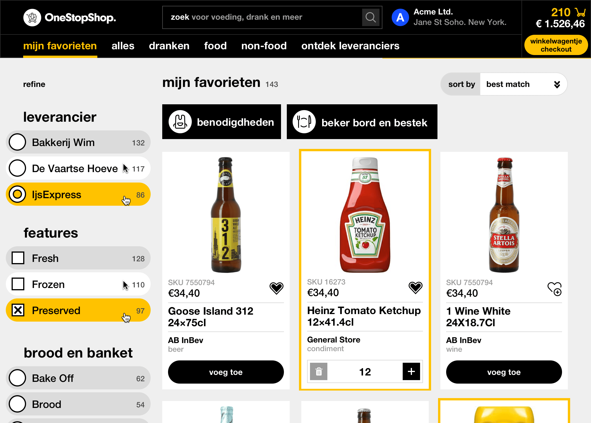
Making such a large catalogue of products and services browsable is big lift by the entire team. The browsing experience is only as good as the tagging, categorization, and descriptions written by the team.
On the UI side, big, chunky filters take up an entire 3-column section of the 12-column site to allow people to progressively narrow in on what they need. Having filters easily accessible can also provide insights into path to purchase and browsing behaviors to inform our further investment in how to connect the right people with the right products.
Branching out from product details
Save time on replenishment
Desktop
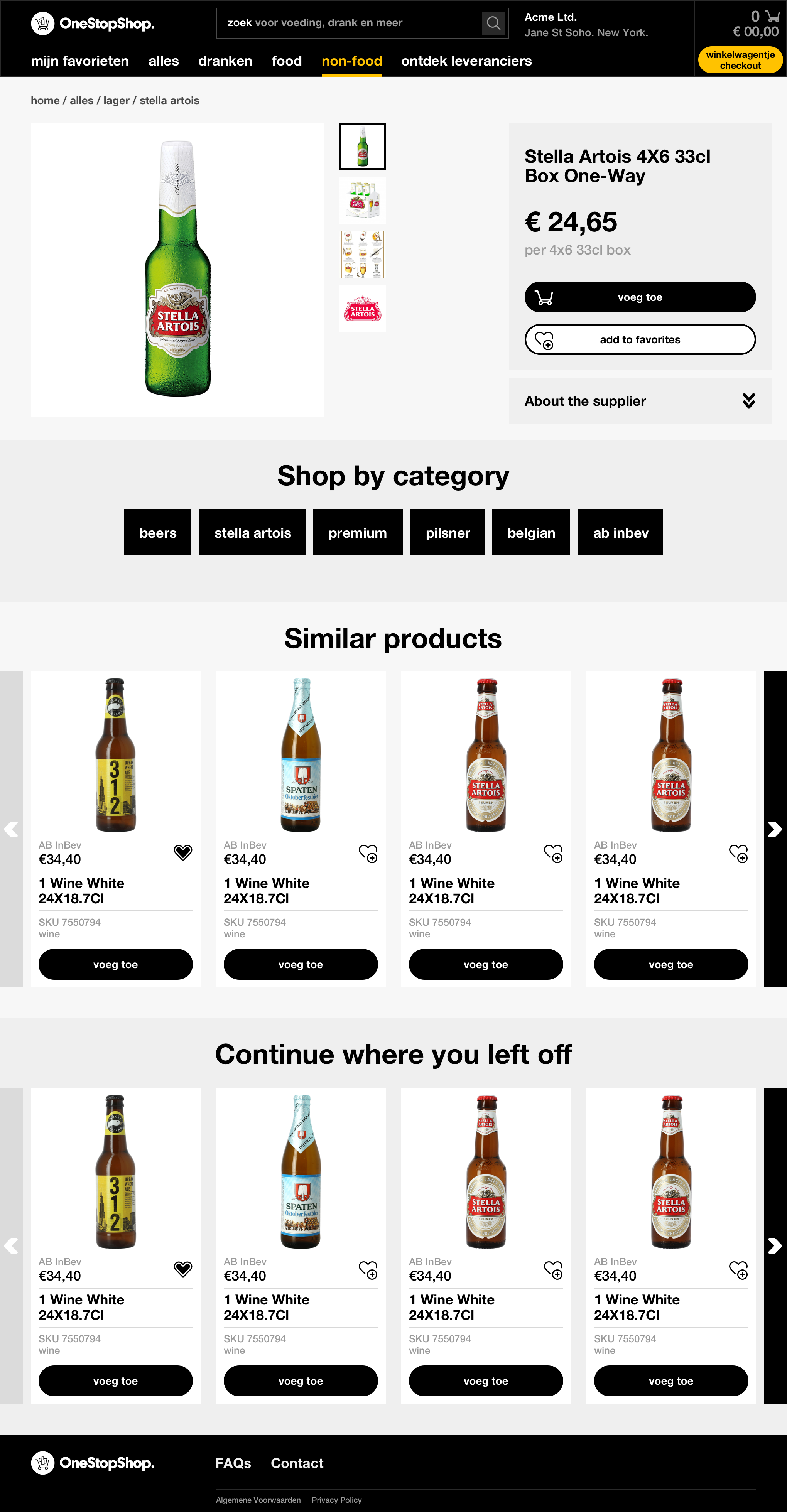
Since the majority of shopper missions will be to replenish known products, landing on the product detail page is likely when browsing for new products to learn more, or to look up a product detail. As an opportunity to organically expose shoppers to additional products and vendors, we added three sections below the product details.
Giving customers large "Shop by category" tiles helps encourage more cross-navigation, especially if the product itself is close, but not exactly right. Maybe Stella Artois isn't what you want, but easily see just the Belgian selection. This also double duties as an educational tool: an at-a-glance "tags" about the product. This also casts a wider net than a carousel of specific products, which has a higher probability of missing the mark, especially in the early stages of developing personalization.
"Similar products" exposes more of the product catalogue without going to another page (ideally weighted towards products that the customer has neve ordered before).
"Continue where you left off" trails every page, for when the customer is done exploring and comparing, and is ready to commit to one of the products they viewed. Instead of needing them to recall the product and search for it, they can quickly add from this visual reminder.
Mobile
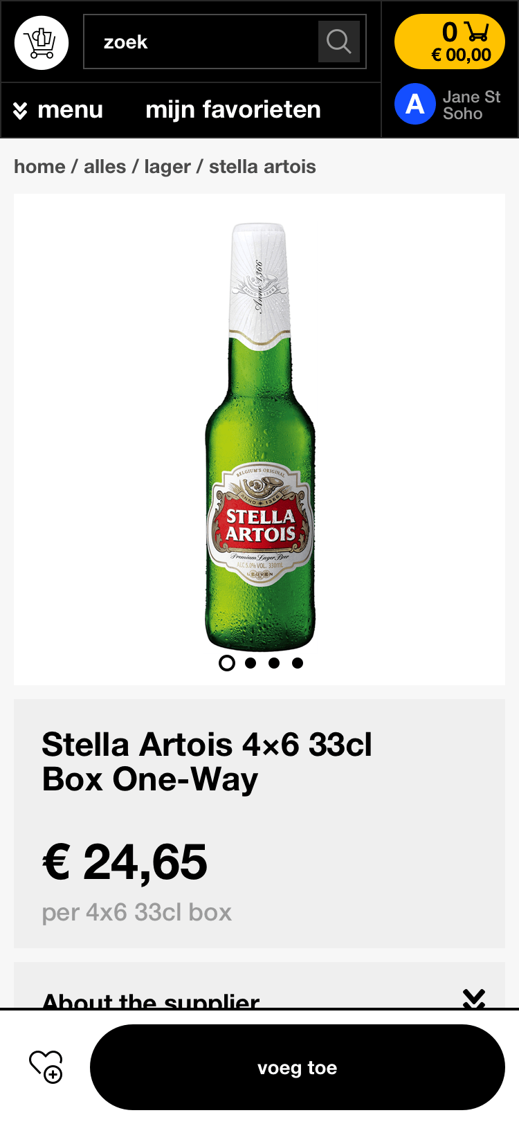
One button "add to cart" simplifies the decision into a single click, then complexity is revealed after this interaction.
The hypothesis is that this allows customers to quickly get the SKU into their cart, even if they may not be sure about the quantity. Once they have the right SKUs in their cart, they can do a final sweep from the cart and adjust all the quantities together.
We may update this interaction after the opportunity to learn more about how customers add products to cart and configure quantities.
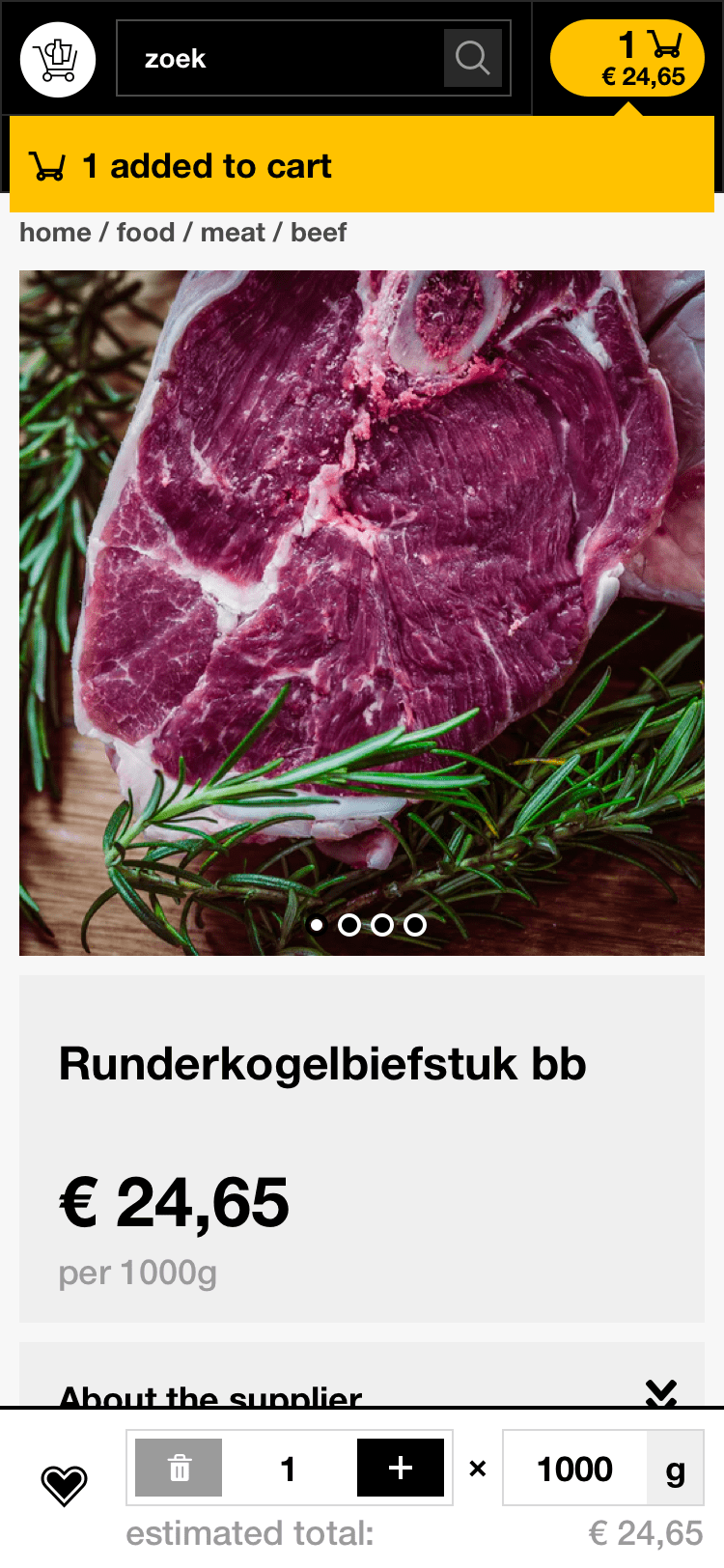
Most products only require a quantity that can be typed in or incremented by clicking +.
Some products, such as meat, require two configurations—quantity and weight per piece. In this example, 1 piece of 1000g steak.
For now, the UI is optimized for a sticky add-to-cart widget that's always visible and available, no matter where you've scrolled on the page. This also allows you to scroll on the product page while customizing your quantity in case you need to check the details (was this a 24-pack or a 36 pack?). Any updates triggers a temporary feedback "snackbar" by the cart to assure the customer their change was saved.
Eventually, there will likely be more business requirements around quantities (such as only allowing multiples of x for quantity) or a specific set of values per piece (only 1000, 2000, and 3000g cuts), leading to UI that needs more space than this sticky footer allows. Until then, this optimizes for speed, simplicity, and convenience.
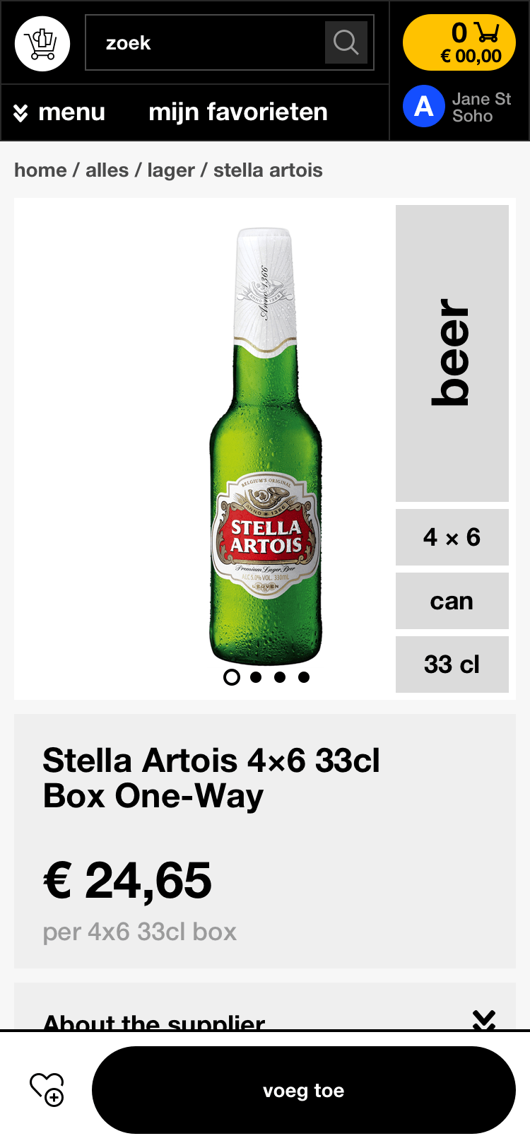
An exploratory design featuring at-a-glance product details over the product image (originally piloted by Unilever) to help shoppers differentiate between easy-to-miss details, such as sizing (33cl), format (can), quantity in a pack (4x6), and category (beer).
Things to learn for future iterations
Save time on replenishment
Being so early in the launch, we all still had many more questions than answers that would help inform the design.
How are people using the search? Are they using it for exploration? Or to jump to specific products? If we see that people are frequently using the search to pull up specific products that are added to cart—maybe we can allow people add to cart directly from a typeahead dropdown (and shortcut viewing the product details).
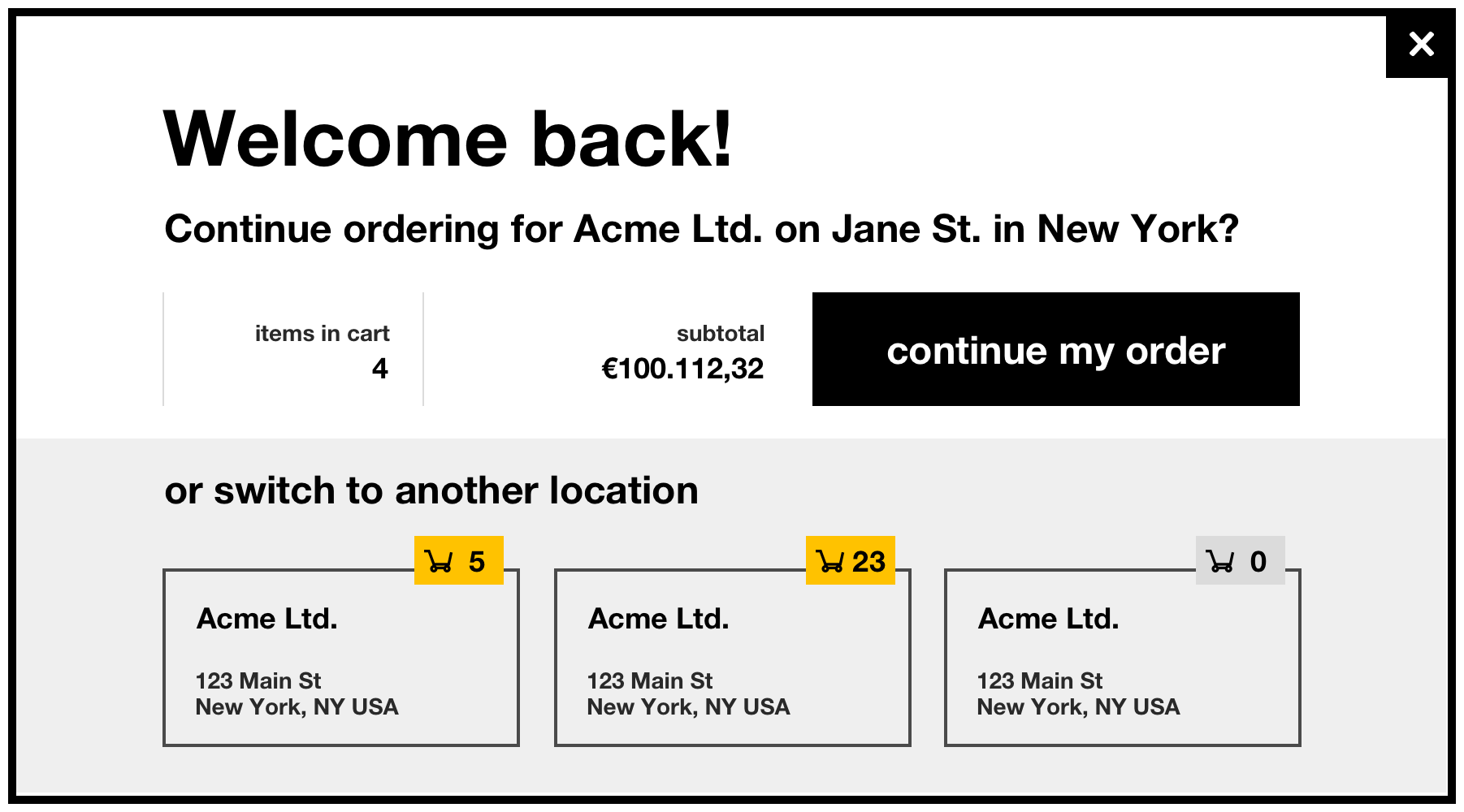
What is customer service getting called to fix? And what are mistakes that we can prevent—especially those that don't warrant a call to customer service, but is a frustrating waste of time? One thing to potentially monitor is whether the active location is clear. A customer may manage procurement for several locations—will they come back to the site after a break, start adding products, only to realize half-way through that they had forgotten to switch locations? If this is seen as an issue, we could always greet multi-location customers with a welcome reminder with their active location to avoid this error?
Can we help people breeze through reordering even more? Is it worth investing in a more specialized replenishment tool that would require entirely custom build-out? An Excel-like list could show even more SKUs, and allow the customer to quickly type down the list the quantities and weights needed. Or have we hit diminishing returns on speed with the current experience and should focus on other aspects of growing the platform and increasing customer satisfaction?
It takes a team to learn, design, test, and build, and I was only a small piece in this group effort. I'm always learning from the OneStopShop and Pixelcabin teams who led the charge, and I'm so glad we were able to collaborate again.
Credits
Engineering and eCommerce:
Gregor Vand from Pixelcabin
Logo and business direction:
The OneStopShop team: Jeltsin Neckebroek and Lourens Keers
Expanding the brand visual identity, copy, and UI/UX:
Meng He