Flying West to go East
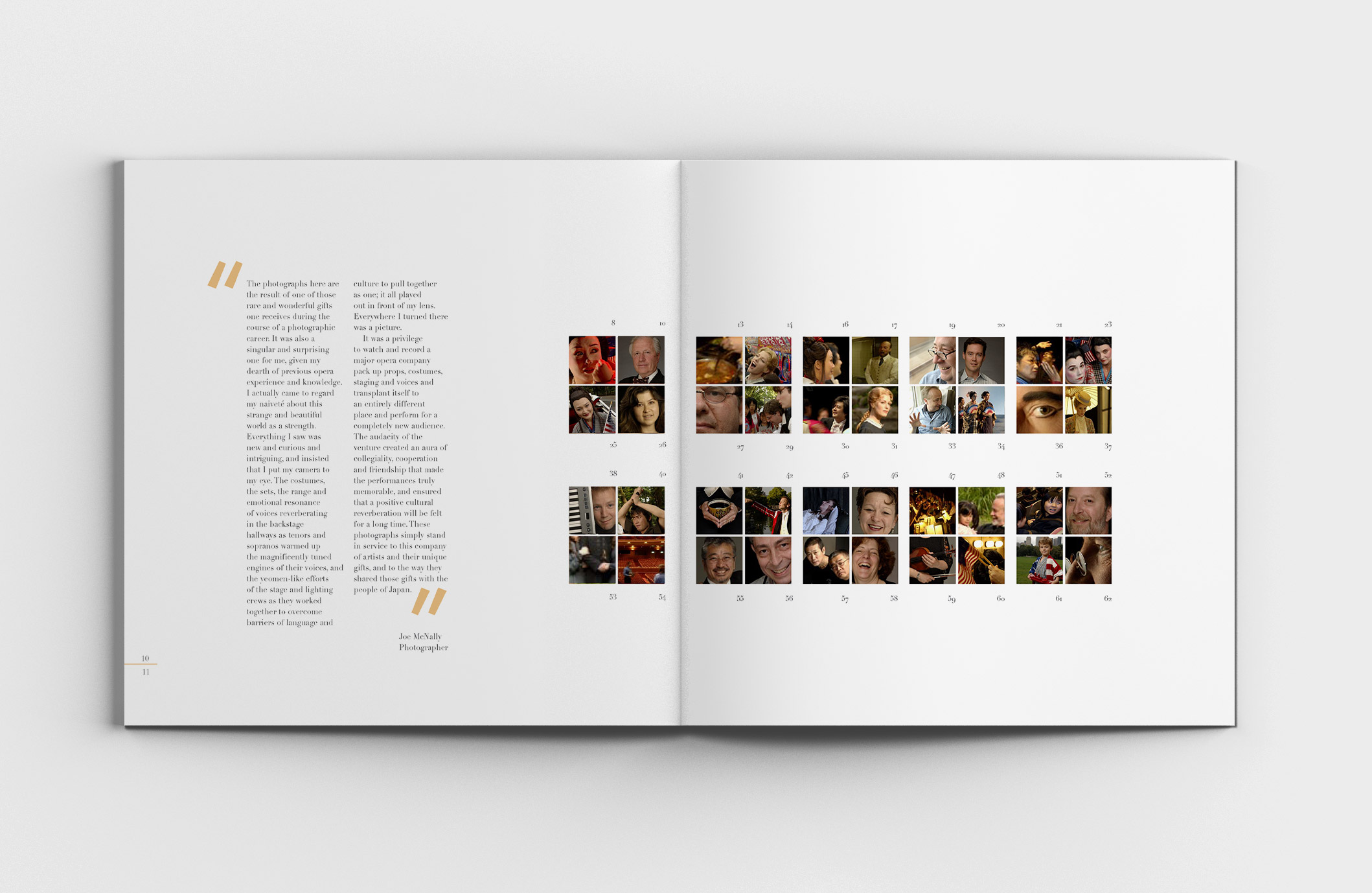
While a student at Parsons, I had the (frightening and intimidating) opportunity to work on real, actual, professional(!) projects. The New York City Opera had just completed their first historic performance tour in Japan, and none other than Joe McNally was invited to create a visual diary.
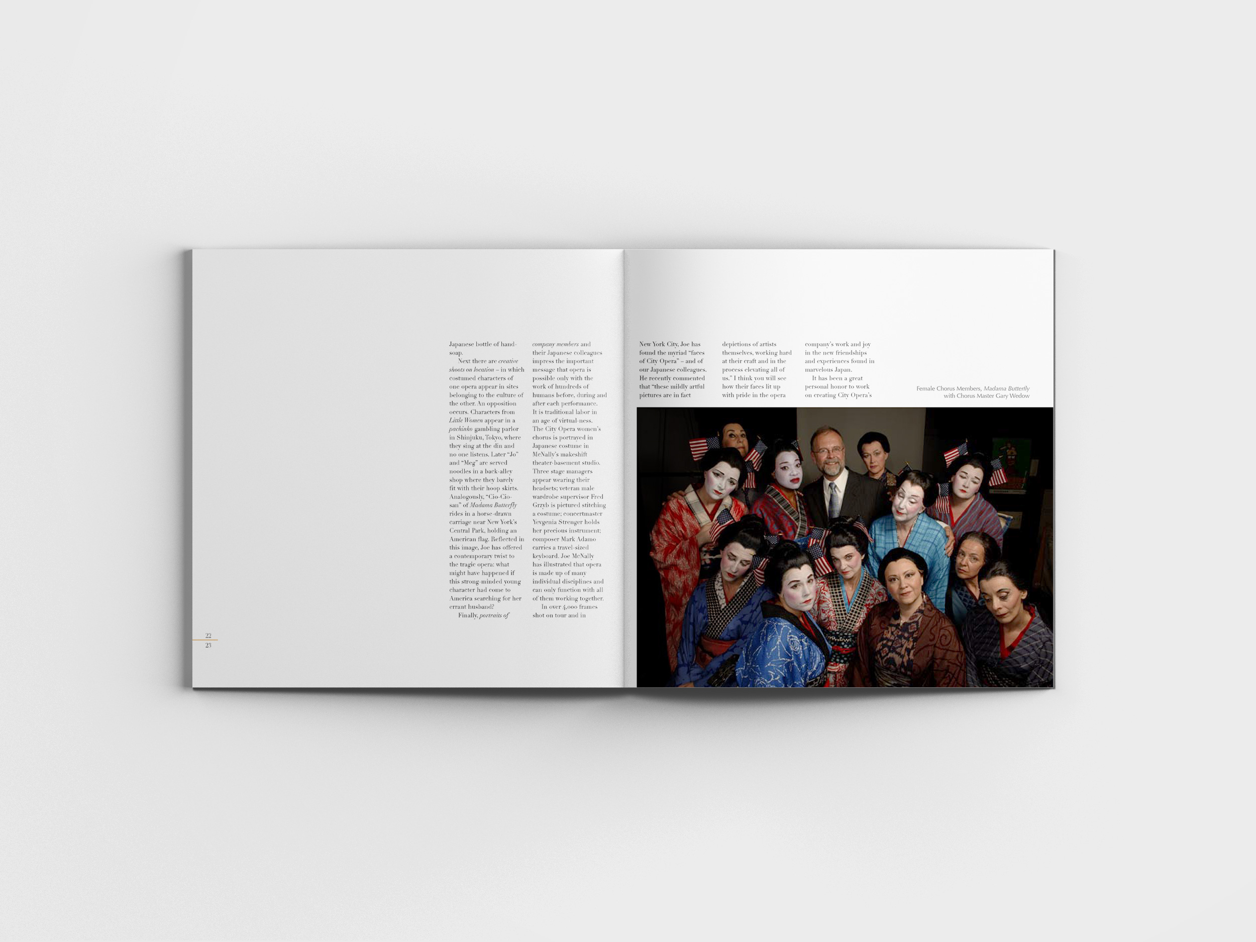
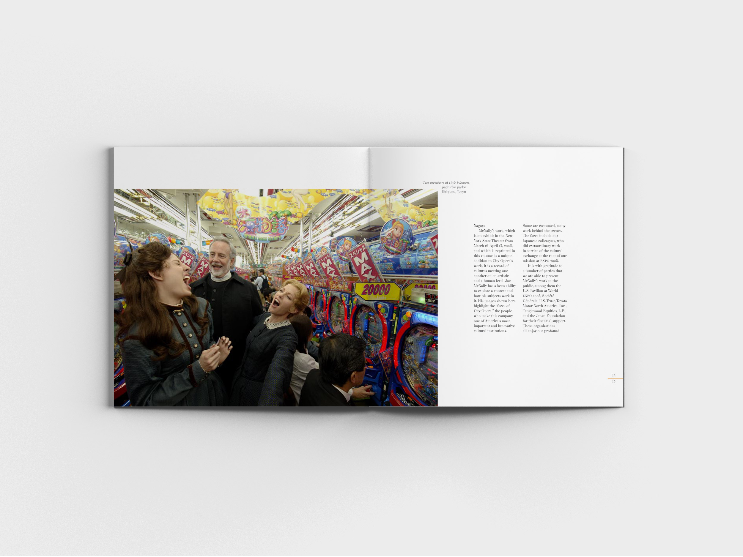
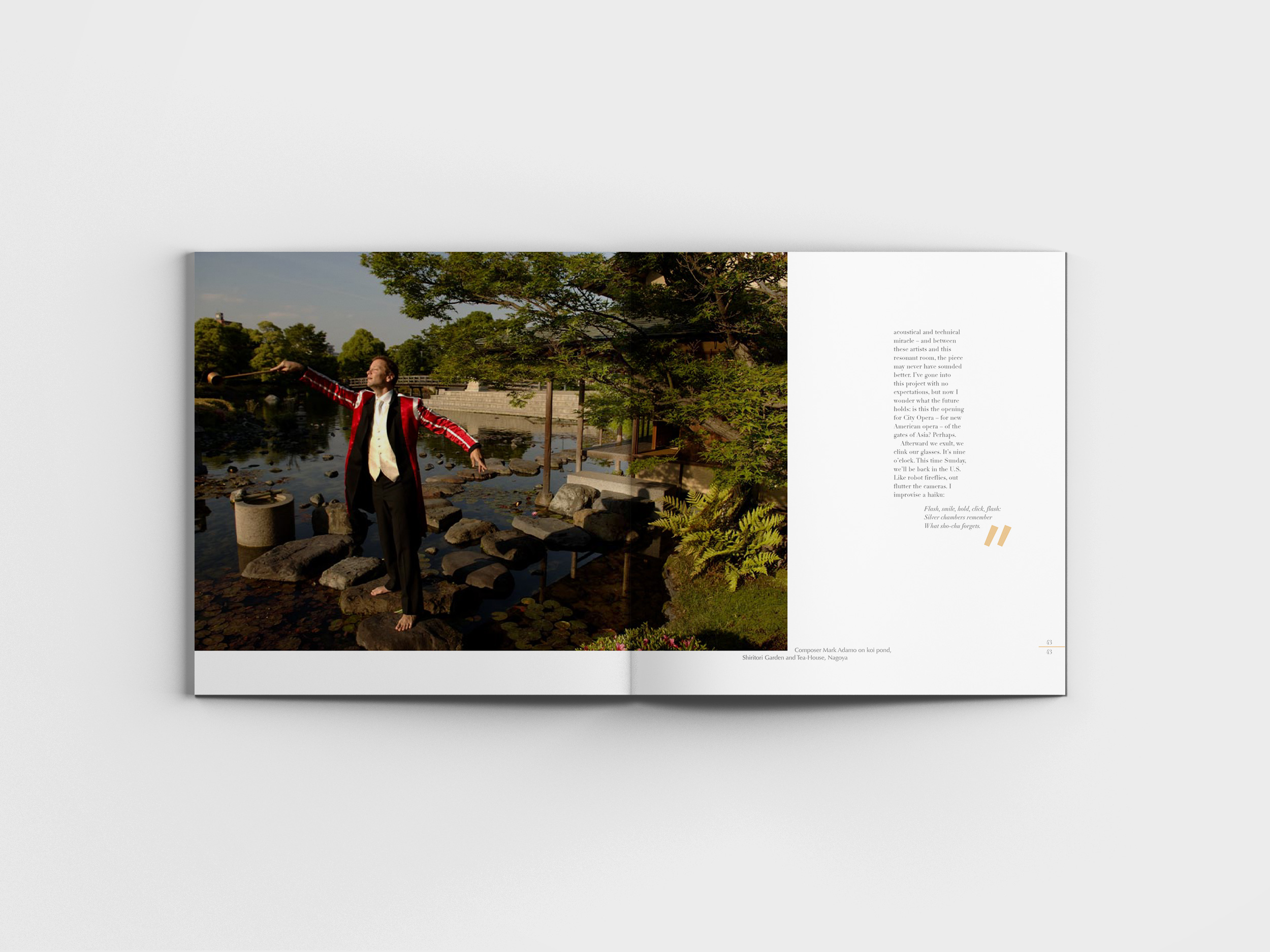
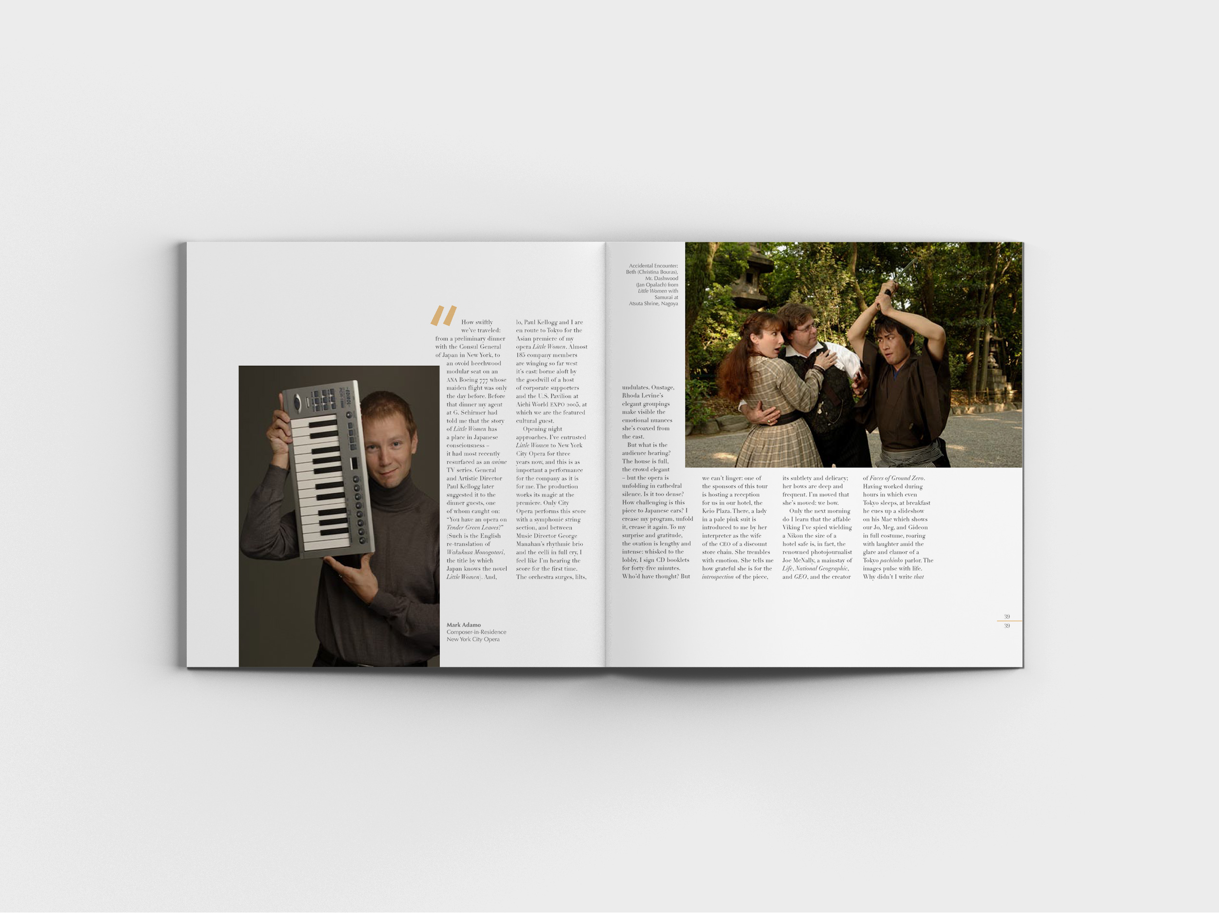
Joe McNally (internationally reknowned photojournalist, who created "Faces of Ground Zero — Portraits of the Heroes of September 11th") accompanied the 185 NY City Opera members throughout the tour, shooting over 4,000 frames to document every moment backstage, during dress rehearsals, public performances, educational sessions, diplomatic engagements, and performers wandering Tokyo, Nagoya, and New York City in full costume.
The final 30 selected photos were to be displayed in a photo exhibition at the New York City Opera at Lincoln center in the spring of 2006, and they invited a Parsons student volunteer to design the commemorative book for the occasion. And this became my first (real) client project.
North / South / East / West
Now, after working professionally for over a decade, I've built up enough mental pattern libraries to jumpstart new projects. But as a student, sitting in front of a blank InDesign document is the most uninspiring designer's block.
There were a few themes I knew I wanted to incorporate.
_
Square. Maybe all the Art History lectures on the Heaven on Earth circle/square archetype finally got through to me, but there is something poetic and lovely about a perfectly square canvas where every direction is equal. Reinforcing the East meets West in the exhibition title, can we incorporate directional signs? Such as a North/South page markers?
_
Vertical Japanese writing. Historically, Japanese text is generally written vertically, and look from afar like long, thin, ribbons of text—in stark contrast to English, which appear as clunky, heavy, rectangular blocks.
_
Incorporate elements of Japanese design without being kitschy. Such as grids from a tatami room (in the contents, organized by carefully-chosen photo details) and Zen principals in simplicity (minimal ornamentation and 2-color palette).
Grid & Layout Guidelines
Similar to work that I do more recently in tech and product, setting style rules at the start helps create a sense of consistency and flow (while maintaining your sanity through all 68 pages).
TYPES OF CONTENT
_
Personal letters written by participants
_
Joe McNally's beautiful photos
_
Caption for each photo
THE RULES
_
Text always followed a 5-column grid.
_
Photos always bled from at least one edge, though preferably two. It's risky placing a photo across the spread that spans the gutter (area that might be sewn into the book), so no faces or other important elements in this center area!
_
Captions, when possible, should wrap around the corner of the photo.
_
White space on the page must always be continuous (photos should never be placed so that any white space on the page is entirely cut off from the rest of the white space).
Typography
Didone type, known for its extreme contrast between thick and thin, is generally off-limits for anything other than display type.
You gotta learn the rules before you can break the rules, they say. As a self-proclaimed typography expert after two typography courses under my belt at this point, I was ready to break those rules! Can we use this extreme contrast to emphasize the theme of contrast in this exhibition? The charm and humor of photographs come from extreme and unexpected juxtopositions—of old/new costumes and dress, East/West cultures, and operatic drama/mundanity of daily life, in-character/out-of-character—it was only appropriate for the typography to match in its extremity.
(For those eagle-eye designers who scrutinize every detail, you'll wonder why it's set in Didot, instead of a classically Italian-made Bodoni to stay true to Puccini. I hear ya, it's not culturally ideal, but Didot's hairline serifs push the contrast further, creating a "sparkling" quality to the text—making the quotes almost dance on the page. Didot's wider letters and higher x-height create a geometry that's more readable and almost has a kanji-ish quality.)

Things I would change
Reflecting back on my work 10 years later is painful.
It's like reading your high school essay analyzing Brutus's relationship with Cassius (complicated, to say the least). All the big words you dropped in to sound smart added nothing but make everything sound pedantic (at best), or cringey (when you select a fancier-sounding synonym that actually changes the meaning). Discovering you can right-click > synonyms on Microsoft Word was a gift and a curse (mostly a curse). And don't even get me started about focusing so much on making tons of random, disparate points to demonstrate to the teacher that I absorbed all the material, and forget to draw any unifying conclusion. What a mess. But somehow, these embarrassing essays still graded okay on the high school curve.
Critiquing my college design work isn't too different.
One common theme in my college work is overdesigning every assignment. I wanted to show that I put in the effort and time; that I'm stringing together concepts we're learning in class; that I'm drawing influence from designers we've studied. The result?
Designs that look like they're trying too hard. Because I was trying too hard to flex my design ego.
Designs that look like they went to a concept buffet and took a little bit of everything for their plate.
Designs where the design takes over and steals the focus from the original goal of the piece—such as to influence the viewer's behavior or to communicate a point.
I'd like to revisit some of my college assignments and tackle them again, now that I'm more experienced. Would I still cringe in another 10 years? What would I do differently 10 years from now?
I'd love to hear if you've revisited any past work—design, writing, music, anything. What did you learn? Let me know on twitter: @menghe
CREDITS
Paul Paauwe, who art directed this design during his evenings and weekends.
Rachael Fry, my friend throughout Parsons who worked on this design with me.