Project Brief
Live! From Tomorrow is like SNL meets Shark Tank. Since starting in 2015 as a live (literally) tech-centered variety show, a few more spokes have been added to this comedic variety show format—from a motorized desk zooming around Washington Square Park for IBM to interviews with Akon and Reverend Jesse Jackson on cryptocurrency for SAP.
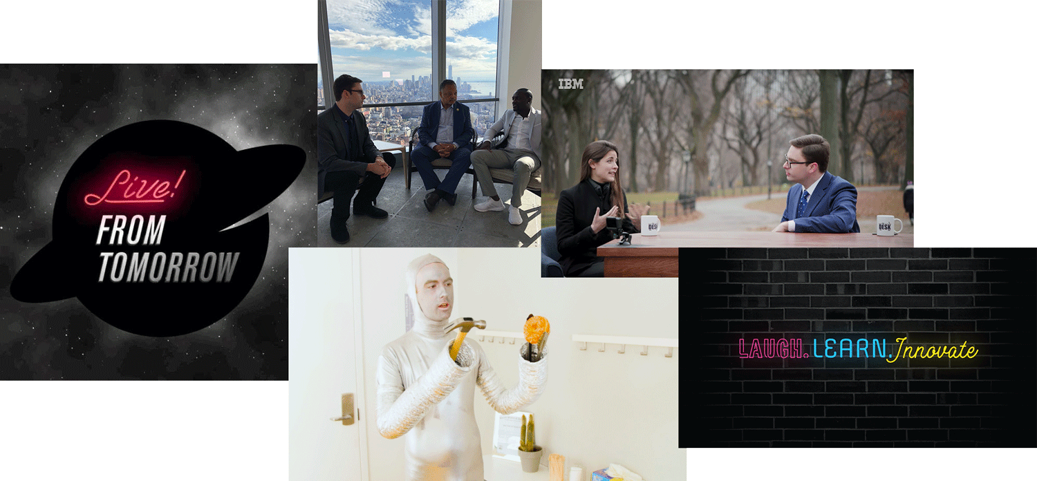
Photos of Live! From Tomorrow (L-R) Facebook, Some-Topia sketch: Dr. Obot,
Live! From the UN!?!, The Desk by IBM, and NYC in the Year 2118
The next spoke in this series was an upcoming festival to celebrate innovation in not just New York tech, but expanding out to the writers, artists, musicians, and creatives.
The assignment:
Add a twist of the current LFT brand that could be used for a series of festivals in Bushwick, Brooklyn.
Inspiration
When I first started working professionally, I'd send my clients an 11-page questionnaire to help me understand the goals of their branding project.
I'd ask questions like:
what motivated you to start your company?
-
if your company was a person—what shows would they binge? what kind of car would they drive? what would they do on the weekends?
-
who are your competitors, and why do your customers come to you instead of them?
-
what colors or visuals do you particularly love or hate?
-
It takes a special kind of person to get through this homework assignment and not immediately ask for their deposit back (I'm so sorry to everyone subjected to this—you know who you are).
These questions aren't exactly easy to answer, and I've come to realize it's a much better client experience (and learning experience for me) to just channel my inner Terry Gross and have a conversation instead. Especially when the project is deeply personal to the founder, having a free-flowing dialogue that goes to unexpected places can help you discover those nuggets of gold that becomes the heart of the brand visual identity.
From the book I'd been trying to slog through (Frank Herbert's Dune), to Matt's childhood Spider-Man comic, fascination with the 1930s Chicago World's Fair, the Bushwick, Brooklyn space they were scoping out, how polarized pop culture has become, longing for a future from an earlier time, and the upcoming dinner event in which he'll present his vision for the festival to potential partners and investors.
Okay. No pressure. So...what if Bushwick's industrial chic had a world's fair in the '30s? Something that captures the exuberant optimism of the 1930s future; something a little gritty, industrial, and not so pristinely perfect; something that's individualistic but the parts combine to create a whole; something that's flexible enough to apply to an entire festival and not feel tired after the first pitch deck.
So, after one hour together, two pages of notes of random, disparate thoughts to connect, here are the three themes we found ourselves coming back to again and again.
1933 Chicago World's Fair
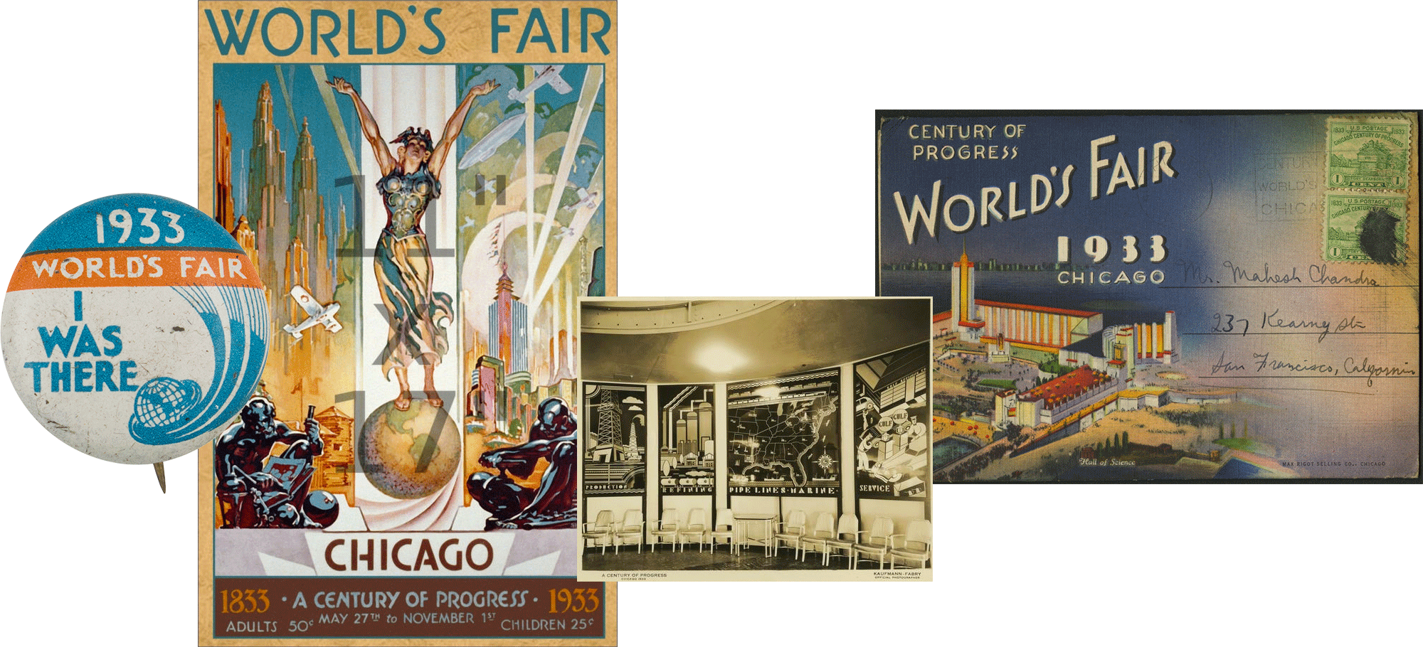
Photos of the 1933 Chicago World's Fair from (L-R) Button Museum, eBay, Historic Pittsburgh, and SAADA
Photos of the 1933 Chicago World's Fair from (L-R) Button Museum, eBay, Historic Pittsburgh, and SAADA
Just half an hour from Manhattan on the L train, Bushwick was once the beer brewing capital of the Northeast in the late 1800s. As the breweries closed, Bushwick suffered through a period of economic devastation until the mid-2000s. Today, Bushwick feels like Williamsburg from 10 years ago—abandoned industrial warehouses have found a second (or third) life as art studios and co-working/living spaces. Although the main thoroughfares are now lined with yoga studios and artisanal coffee bars, you'll still find vestiges of Bushwick's industrial roots with actual artisanal businesses—where artisans literally work with their hands. Screenprinting shops. Motorcycle repair shops.
Bushwick / Brooklyn / NYC
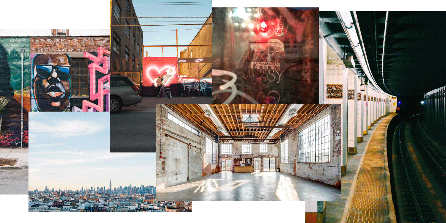
Just half an hour from Manhattan on the L train, Bushwick was once the beer brewing capital of the Northeast in the late 1800s. As the breweries closed, Bushwick suffered through a period of economic devastation until the mid-2000s. Today, Bushwick feels like Williamsburg from 10 years ago—abandoned industrial warehouses have found a second (or third) life as art studios and co-working/living spaces. Although the main thoroughfares are now lined with yoga studios and artisanal coffee bars, you'll still find vestiges of Bushwick's industrial roots with actual artisanal businesses—where artisans literally work with their hands. Screenprinting shops. Motorcycle repair shops.
Handmade Retro Futurism
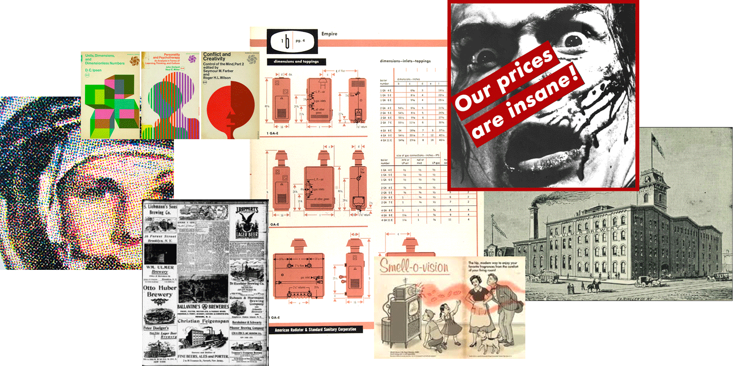
Photos (L–R) Halftone example, McGraw-Hill Rudolph de Harak covers, 1909 New York Sun of Bushwick brewer, Ladislav Sutnar manual, Smell-o-vision, Barbara Kruger–Untitled (Our Prices Are Isane!), William Ulmer Brewery
Inspired by the current LFT logo with an Jetsons late show feel, it's easy to feel nostalgic for that promise of the Atomic-era future. Some of the innovations from that time are now a punchline—Smell-O-Vision, anyone? Innovation is funny that way—some potentially laughable inventions are still commonplace today (can you believe the ticket price of a 3D movie in Manhattan is $20.99?!), and it's fun to think about what bleeding-edge technology today will be the Smell-O-Vision of tomorrow (VR?).
Design
Design Motifs


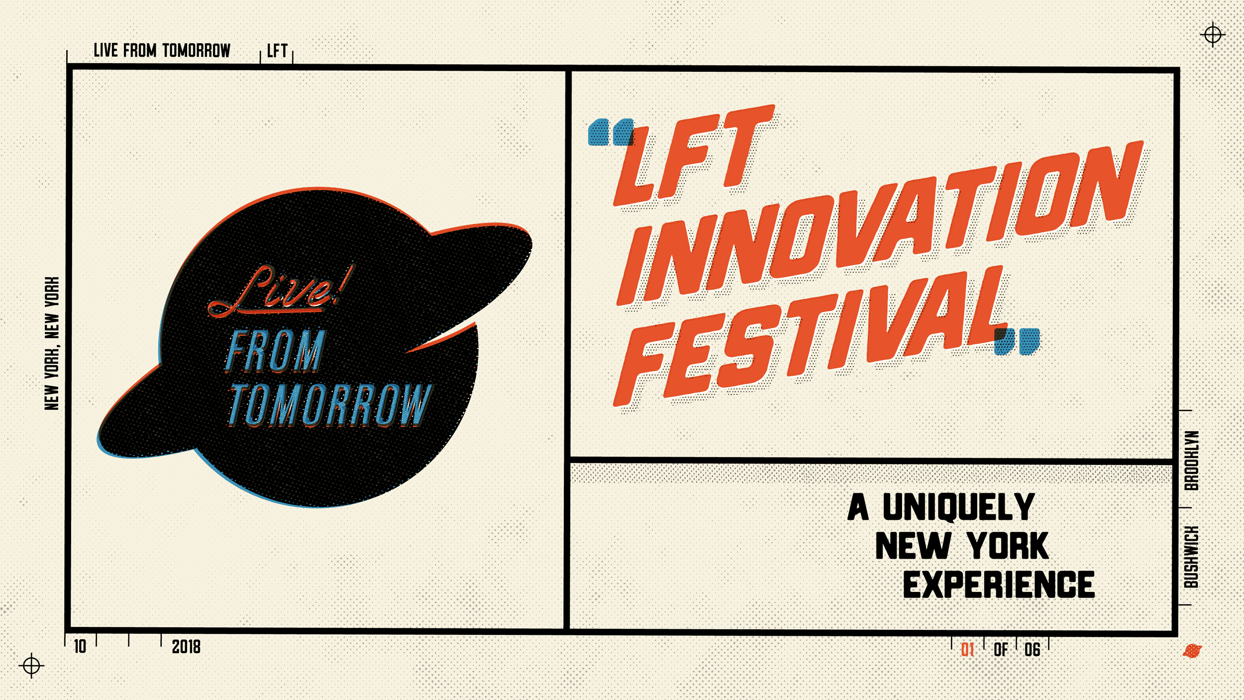
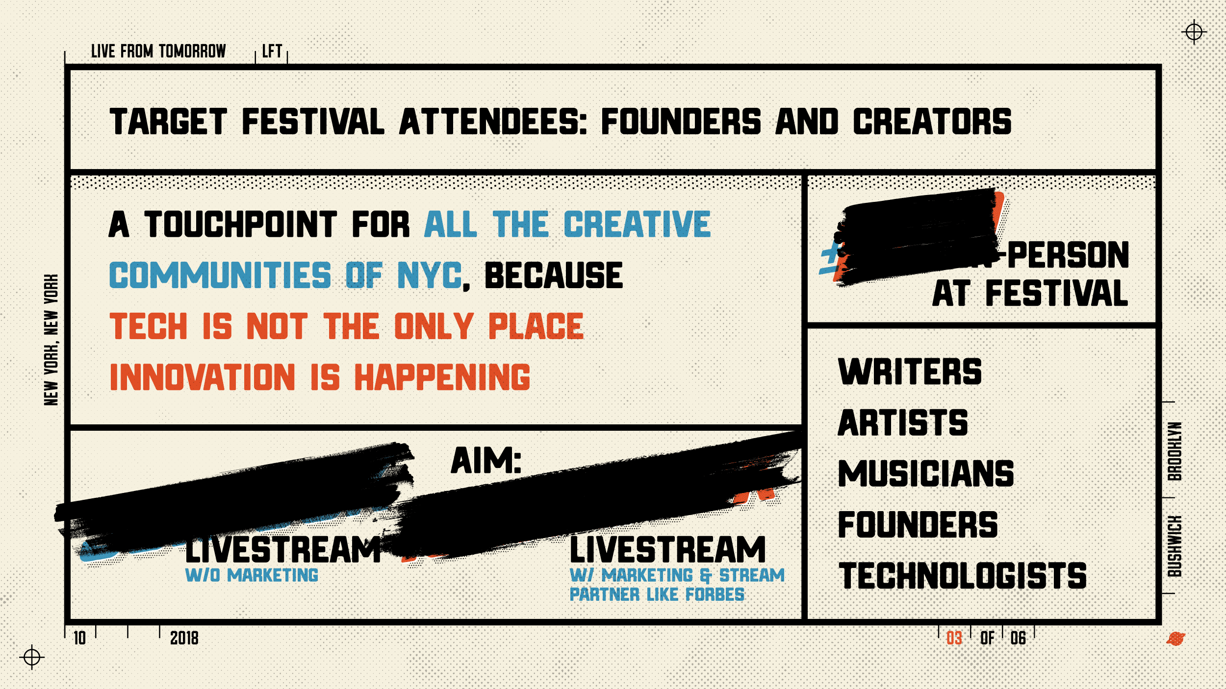
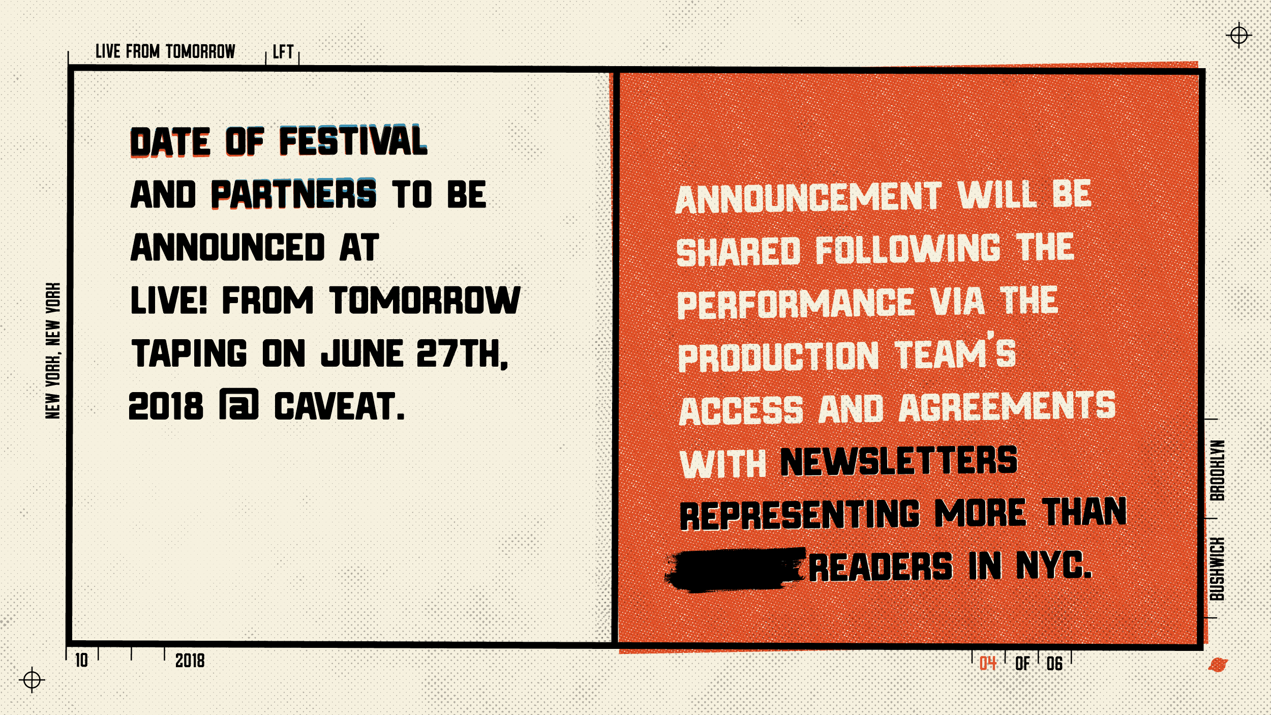
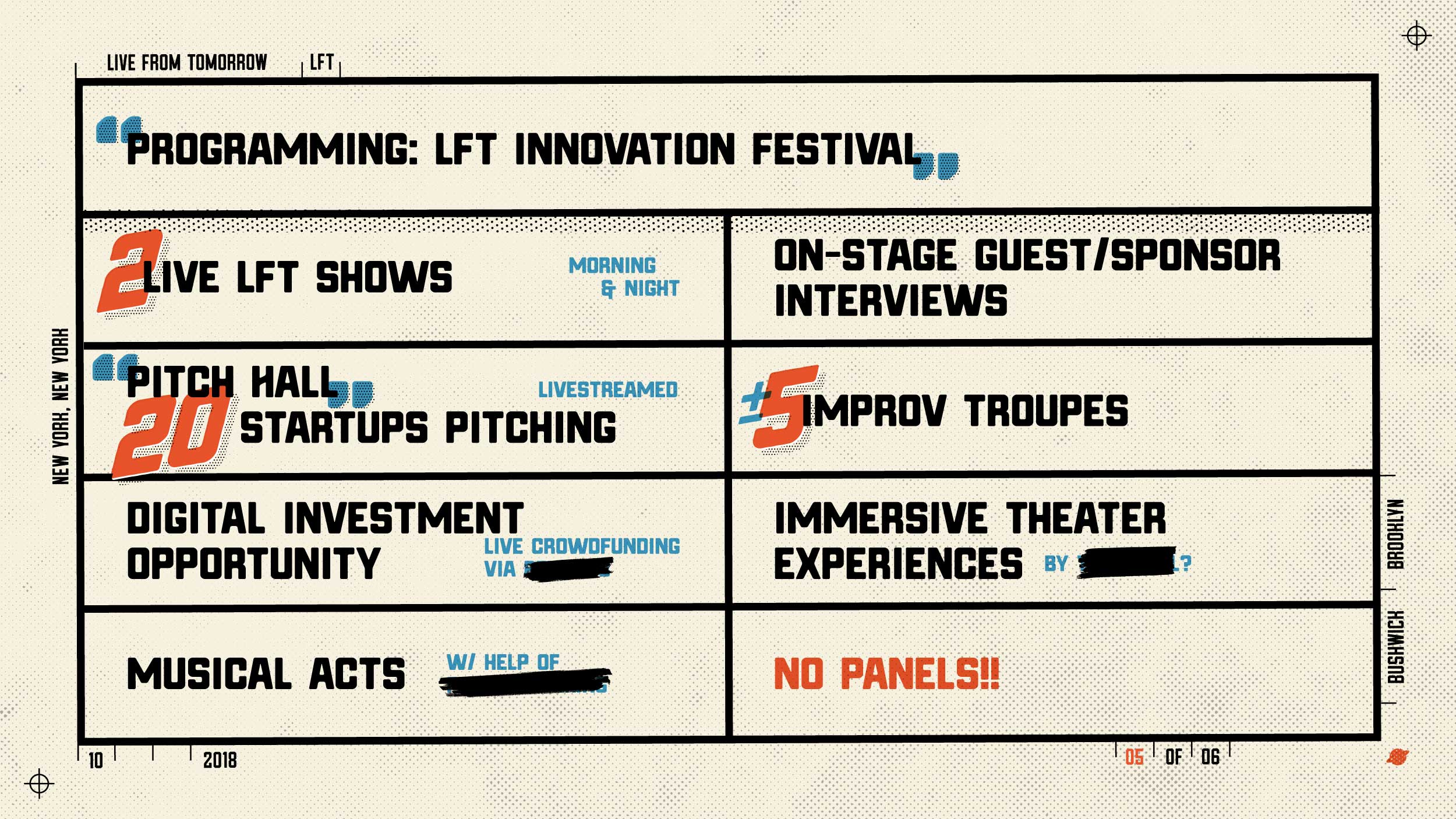
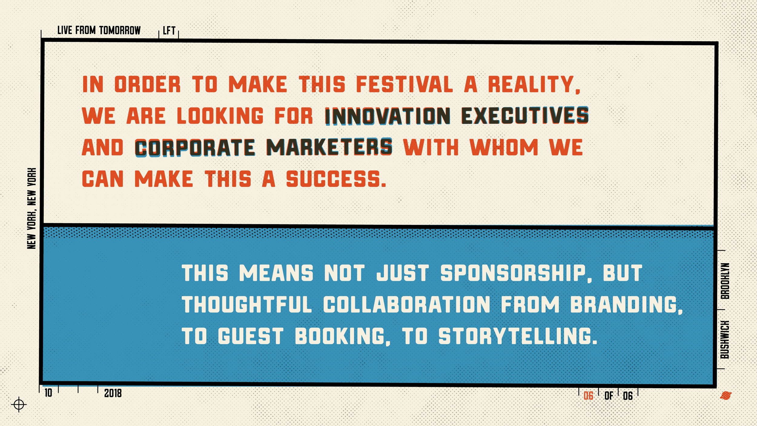
Three colors – black, blue, orange. Inspired by Chicago World’s Fair pin, plus a twist on CMYK (omitting yellow ink because the "paper" is yellow).

Typography – is a mixture of industrial with a kiss of art deco geometry and Barbara Kruger.
Gridlines & Registration – from industrial beer labels and industrial instruction booklets to add additional notes (names, dates, and locations) and navigation (page numbers). In print, these notes are trimmed before printed pages are bound and presented.
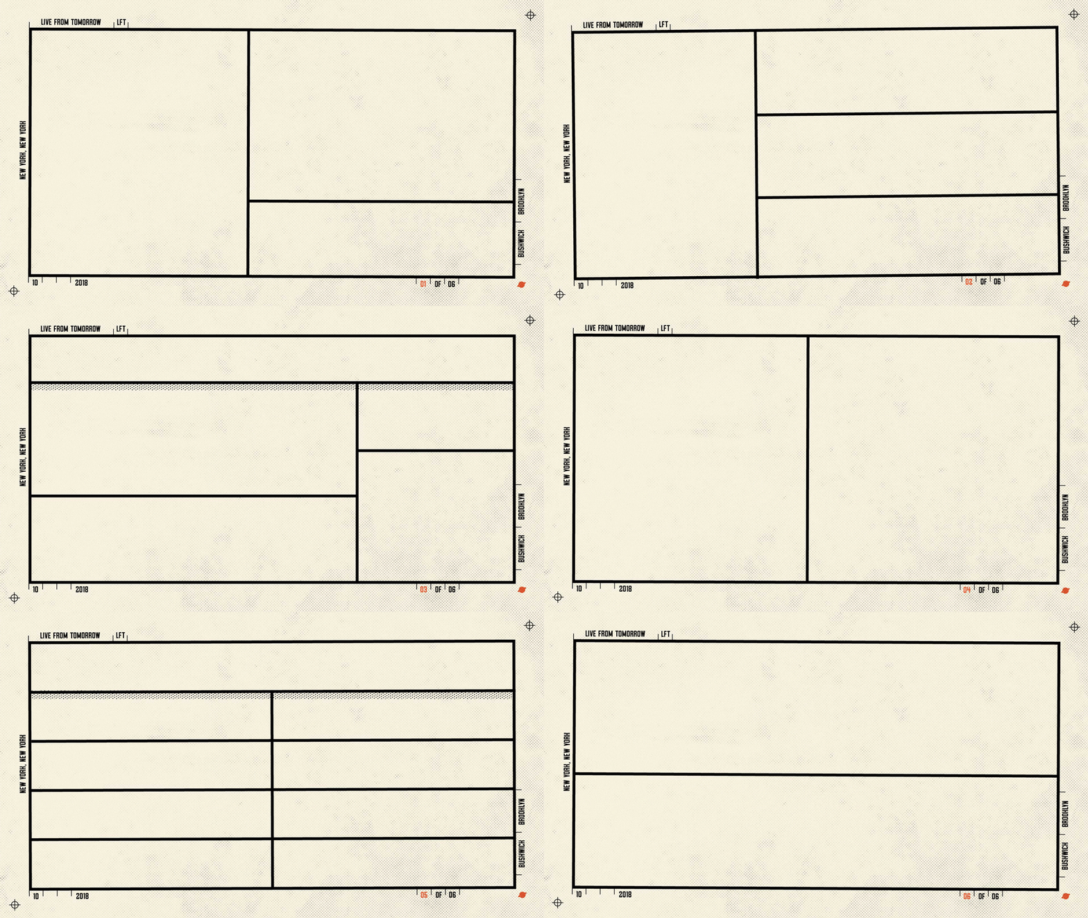
Handmade – even with the registration marks as guides, everything is a little off-kilter, as if hand-fed imperfectly into a printing press, or the silkscreens for each color were all a fraction of a degree off. These intentional "registration errors” soften the otherwise perfectly rigid visuals that modern tools like Adobe Illustrator and digital printing allow us to achieve. As you advance through each slide, the precise gridlines now get to loosen up and dance around.
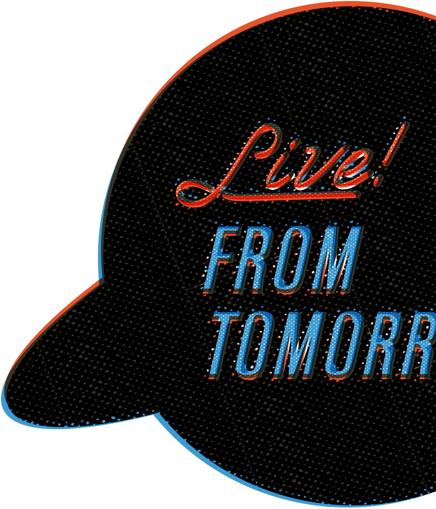
Halftones – since we're limited to three ink colors, any shading will need to be placed in a halftone pattern to simulate lighter shades. This patterning also adds an all-over "dirtiness" off the industrial streets. It's a fine line between effortless Bushwick cool and overworked distressed kitsch—and it surprisingly takes a lot of effort to strive for effortlessness.
The Pitch Deck
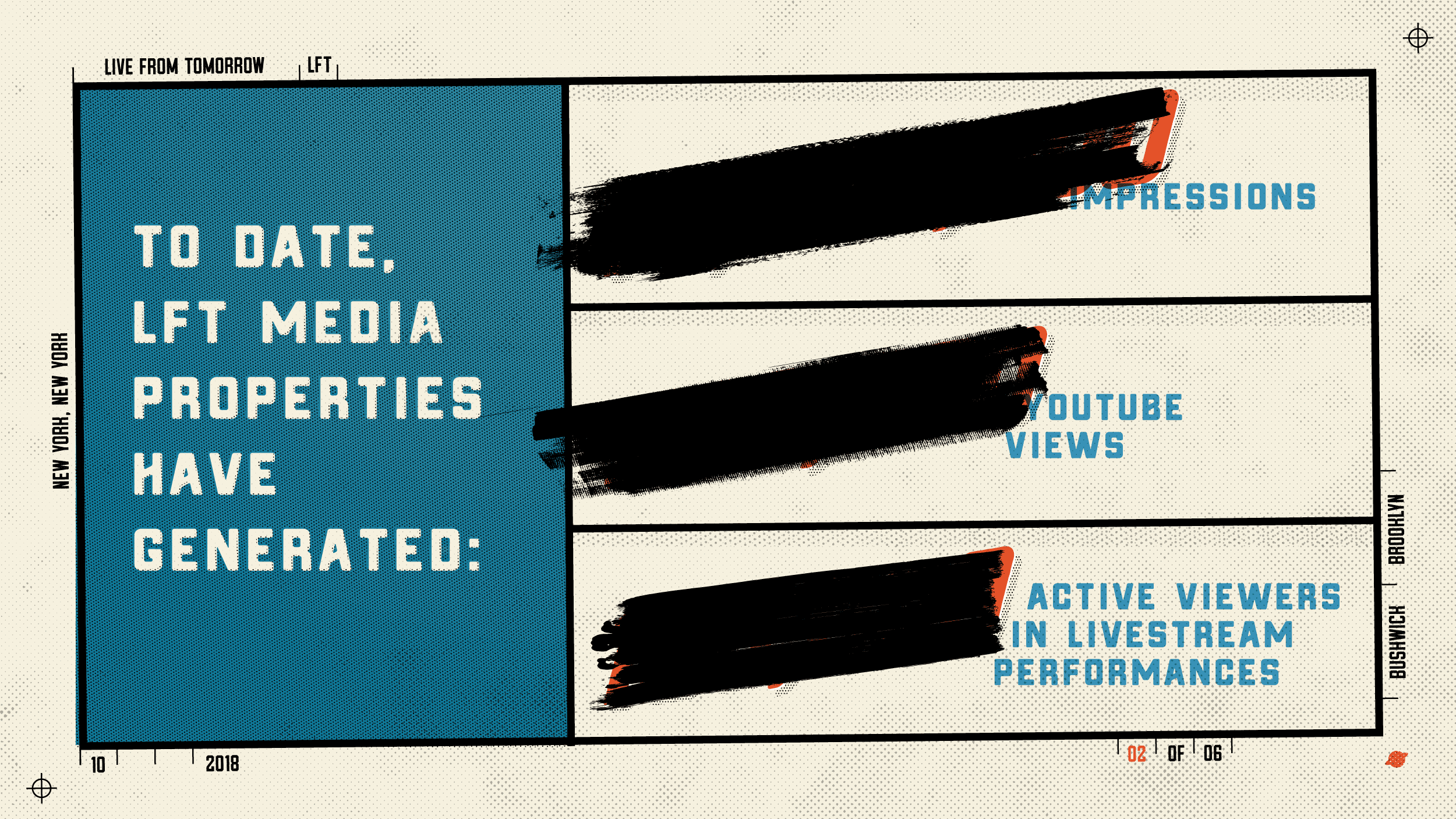
Content by Matt Hooper and John Lynn.
Some content Sharpied out for confidentiality.

Thank you Matt Hooper and John Lynn for this opportunity to work together. Learn more about Live! From Tomorrow and watch select clips on YouTube.


