eCommerce conversion rate optimization (CRO) and A/B testing
My now good friend and analytics partner Lea Masatsugu and I first met when we were tasked with developing an A/B testing curriculum for a portfolio of direct-to-consumer eCommerce companies spanning the US, Latin America, and Europe. Analytics + Design was a 1+1=3 kind of partnership, where we each multiplied the others' value.
Since then, I've worked with Lea and other analytics collaborators to develop our own framework to use with eCommerce clients in a test, learn, and iterate approach. It help us efficiently uncover opportunities, form hypotheses, align with business leaders, and collaborate with product teams.
Although clients still present new challenges that compels us to adapt our thinking and process, here's what we've learned so far:
Get the FREE Google Slides template
Get the FREE Google Slides template
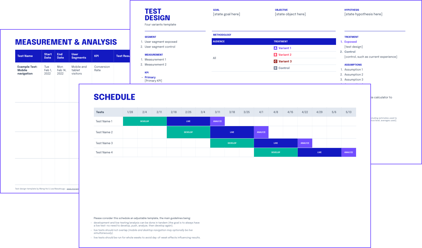
Use our template to help design your A/B tests, organize your analysis, and schedule each release.
Use our template to help design your A/B tests, organize your analysis, and schedule each release.
Why A/B testing is worth doing
For most startups, A/B testing is kind of like getting five servings of vegetables per day — you know you should do it, but most people don't. There are so many reasons not to:
- There are too many other things to work on.
- Why test it when you can just release it?
- It's too much process.
- We've tried it before, but it didn't move the needle.
When A/B testing programs have failed to catch on, it was usually one of these four reasons:
There are too many other things to work on.
The framework we use for conversion rate optimization and A/B testing can actually help to identify and prioritize high-impact, low-effort projects. We look for high-confidence areas of high usage/traffic or high revenue, where even a small lift would have impact.
Why test it when you can just release it?
By releasing as a test, you'll not only have a better sense of how this release impacted behavior, but also gain valuable insight by validating or invalidating your hypothesis. Plus, once the process is in place, it's almost as easy to deploy each change as an A/B test as it is to push live to all segments.
It's too much process.
Our hope with this workflow is that it becomes habitual because it's helpful—not bureaucratic overhead (we hate that too). Just like how there was a sea change in writing user stories instead of tasks, we believe that the exercise of writing a hypothesis helps both the process of creating and objectively evaluating the design solution. The rest are guardrails to help non-analytics experts draw insights from data, reach statistical significance, and to help interpret the results.
We've tried it before, but it didn't move the needle.
For every test that's hyped to be a $300M button test, there are just as many 41 Shades of Blue experiments that neither generates sales or unlocks customer insight. A test needs to be focused enough to generate learnings, but not so ambitious that it doesn't get done (or is a nightmare to analyze), and not so small that even conclusive results don't matter.
What testing can and can't accomplish
Another reason why A/B testing can sometimes seem ineffective is when it's being asked to carry too much strategic weight. A/B testing isn't a substitute for product strategy—the team still needs to choose which hill to climb, and A/B testing can be a beacon to help you climb toward that apex.
While you're in the thick of building and growing a product, it's not always easy to tell if you're climbing up to a local maxima or if there's a much larger global maximum next door that would require a pivot to your value proposition and a redesign. For this, I refer to the excellent Nielsen Norman Group article Radical Redesign or Incremental Change?
Realistically, most teams are balancing both visionary strategy questions and the day-to-day fundamentals of running a business. You're incrementally improving towards your current vision, with a healthy side of growth opportunity speculation.
To ensure we don't mix objectives and end up achieving neither, we created two different workflows.
"A failing company with a poor strategy cannot blindly experiment its way to success"
— Jim Manzi, from his book Uncontrolled
WORKFLOW ONE
Strategy
To help forward-looking strategy, we'd turn our analytics focus toward macro consumer insights to expose larger (and more uncertain) opportunities, and design tests to help reduce risk in any drastic changes.
WORKFLOW TWO
Optimization
To help optimize the current business—focused on quick wins that will deliver results.

Visionary
hunt for the global maximum
forward-looking
Fundamental
optimize for local maxima
rooted in the present
Fundamental
optimize for local maxima
rooted in the present
Strategy
GOAL
Expose larger business opportunities or lessen uncertainty
DESCRIPTION
Extract macro consumer insights from UX analysis and translate to tactics to drive behavior change. Or design tests to help validate dangerous assumptions when repositioning.
DELIVERABLES
1 deep dive with exposed analysis
CONTENTS
- Identify Objective
- Learning Agenda Case Studies
- Test Design
- Test Assets
- Execution Plan
Optimization
GOAL
ROI-focused tactics and quick wins
DESCRIPTION
Identify critical points of friction influencing key KPIs and translate hypotheses to high-impact test designs.
DELIVERABLES
3–5 optimization test designs
CONTENTS
- Testing Strategy
- Test Designs
- Test Assets
- Execution Plan
↑
The focus of this article
The three principles we follow for optimization
Our goal was to create a framework so that A/B testing becomes an engine that reliably delivers real business value in the form of increased revenue or customer insights. It also needs to be light-weight enough to address all the earlier objections: not enough time, not enough impact to justify the time investment, and results are too often inconclusive or not widely applicable to be valuable.
We distilled our approach down to three principles:
- Low effort ↓
to develop, deploy, and analyze - High impact ↓
for business goals and customer development - High confidence ↓
in the hypothesis based on available information
Let's take a closer look at each of these.
1. Low effort
Keep things simple, both conceptually and executionally. One of the most common reasons teams fall off on testing is it ends up taking too much time. Even super enthusiastic teams are at risk of overextending — designing excellent, but complicated tests which are time-consuming to launch, and also difficult to analyze. It's almost always better to build and keep momentum by launching several smaller tests, than to design one giant test that becomes higher-pressure to deliver positive results.
Conceptually, this means that nothing is being drastically reevaluated and post-test analysis will also be more manageable.
Executionally, our goal is to fit design and engineering into one sprint. When designing, what's the leanest implementation to test this hypothesis?
2. High impact
There's always going to be interesting data everywhere. From a conversion rate optimization standpoint, this is a trap we worked hard to avoid.
One trap of interesting data is wasting time in the analysis stage. Whenever you open Google Analytics, there's always going to be an anomaly begging for investigation. It's dangerously addictive to go down each of these "interesting data" rabbit holes and try to solve each one as a puzzle — before you know it, hours have flown by and you don't have anything actionable.
Another trap is investing time implementing clever solutions that might have a large impact (even doubling or tripling conversions!), but on a feature that only reaches a tiny segment of visitors. Unless there's a valuable customer learning, we'd consider this a failure from a conversion rate optimization standpoint.
To avoid analysis paralysis and to identify high-impact potential tests, we followed these three criteria:
- High traffic / engagement areas so that even a small lift would yield meaningful results.
- High revenue areas where even a small lift in traffic / engagement would yield meaningful results.
- A valuable learning, such as validating a dangerous assumption.
3. High confidence
Lastly, we optimized for hypotheses that we’re most confident in, rather than speculating on unknowns. This meant:
- Form an opinionated and focused hypothesis (to avoid testing too broadly and risking inconclusive results).
- Capitalize on existing behavior (instead of trying to change or influence new behavior, which is risky and difficult).
- Focus on what’s not working (leave personas, features, and flows that are working alone).
Test Design Format
Test Design Format
Opportunity discovery
Each test design is divided into four prompts to help guide your analysis. Starting with the objective data observed, your interpretation of the data and insight, the hypothesis, then finally your proposed test design.
ONE
Data & observations
- The raw data of who is doing what, where and when.
TWO
Interpretation & insights
- The interpretation of the data — what theories do we have for why this might be happening?
- What are our assumptions?
- What are the opportunities?
THREE
Hypothesis
- The hypothesis to validate whether our interpretation is correct.
FOUR
Design to test
- Design assets to illustrate how the implementation of the test could work.
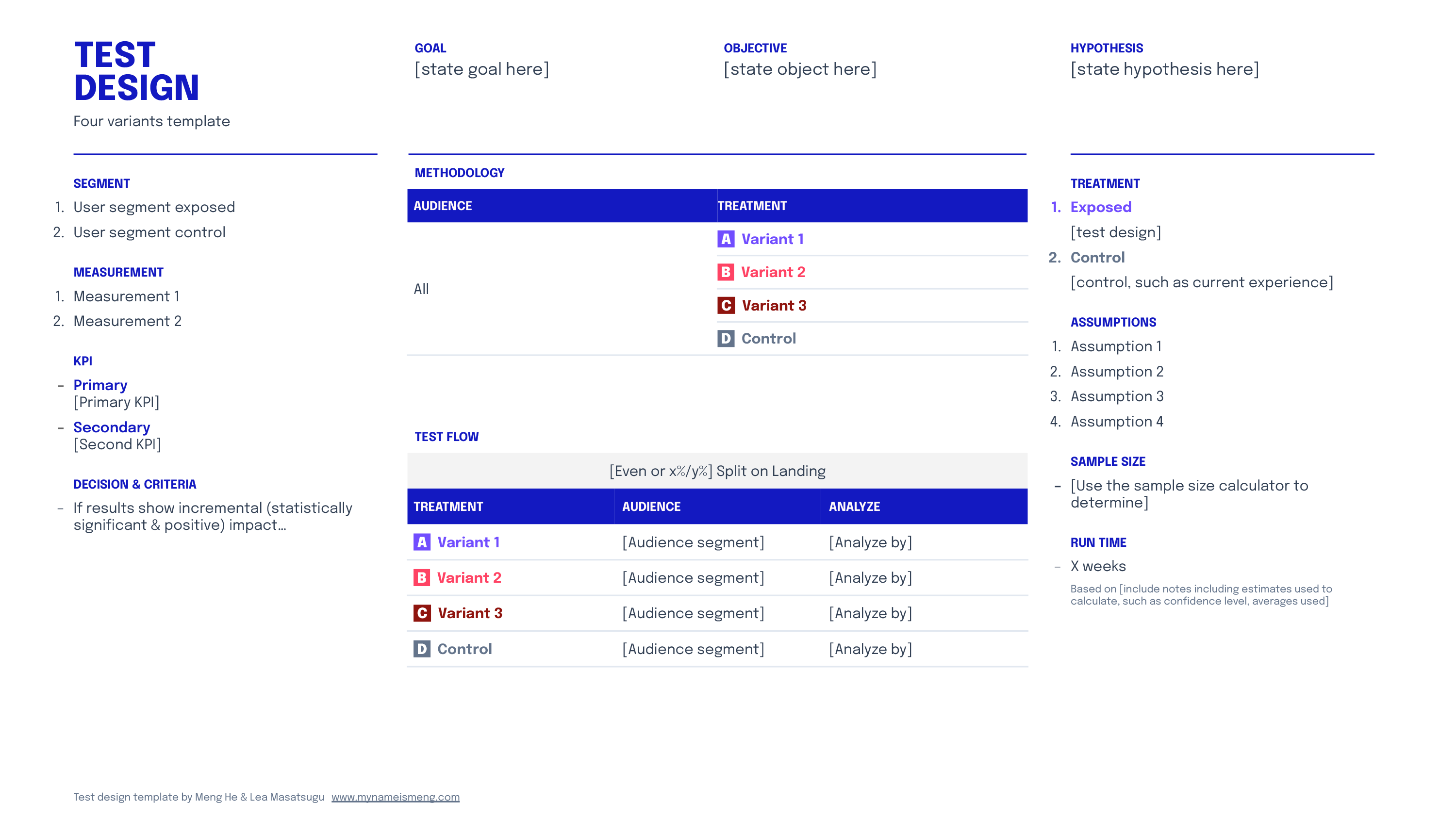
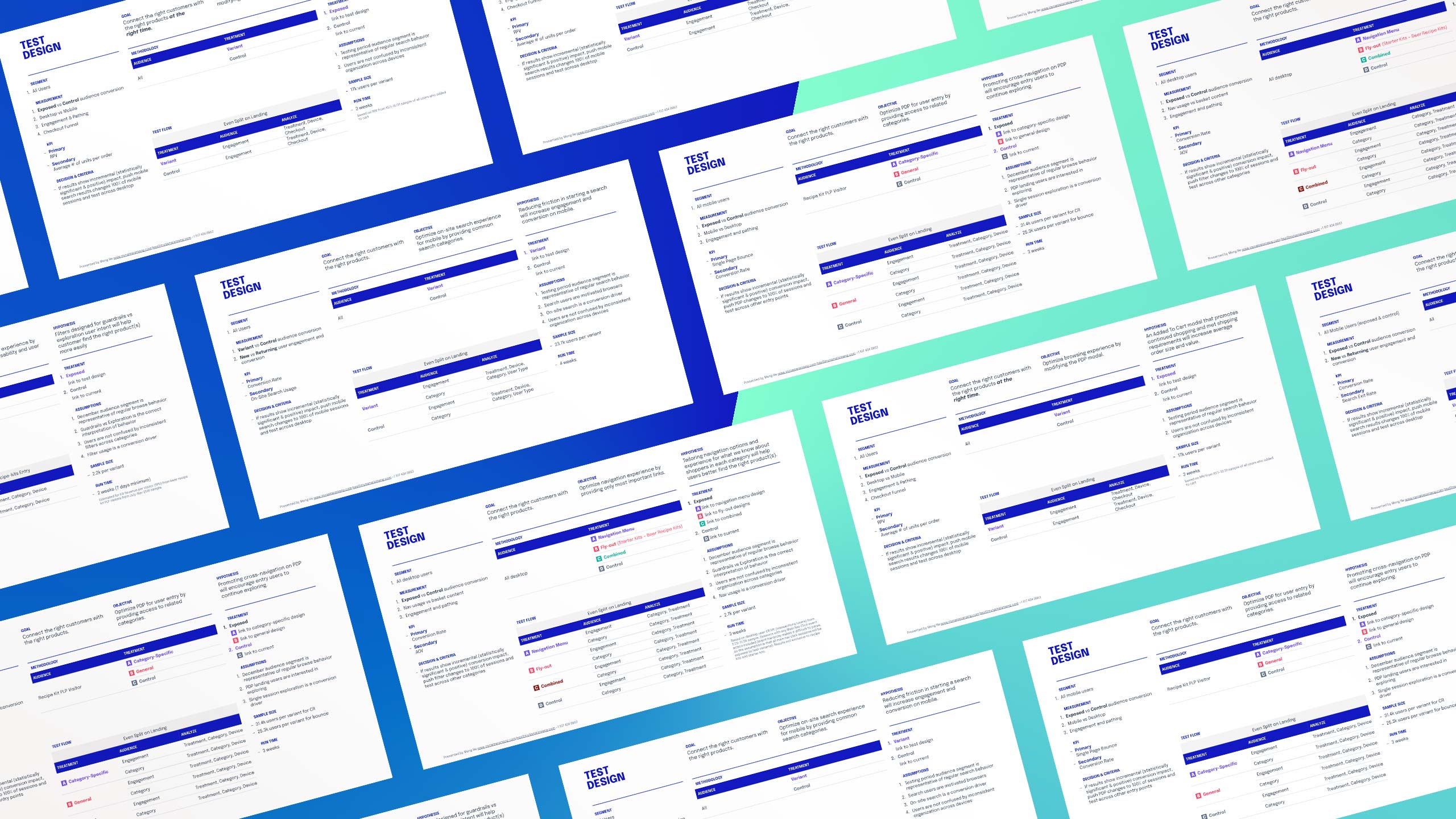
Test design template
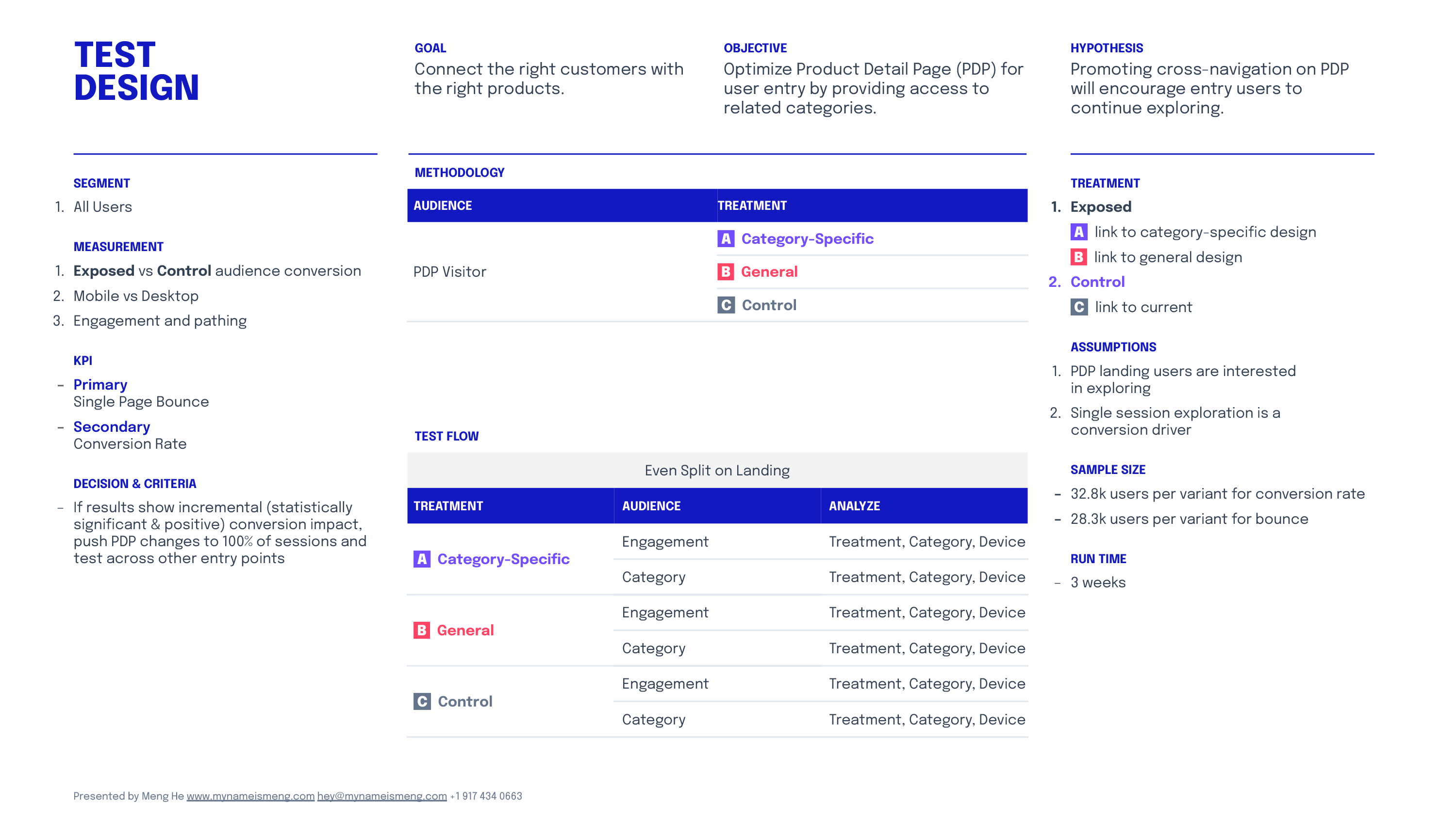
This page charts all the details of the test that will be entered into a A/B testing tool like Optimizely or Google Optimize.
You'll need to make strategic decisions around which KPIs determine success, and think through what assumptions you may be baking into the test.
You'll also need to calculate sample size and run time to achieve statistical significance using a tool like Adobe's Calculator.
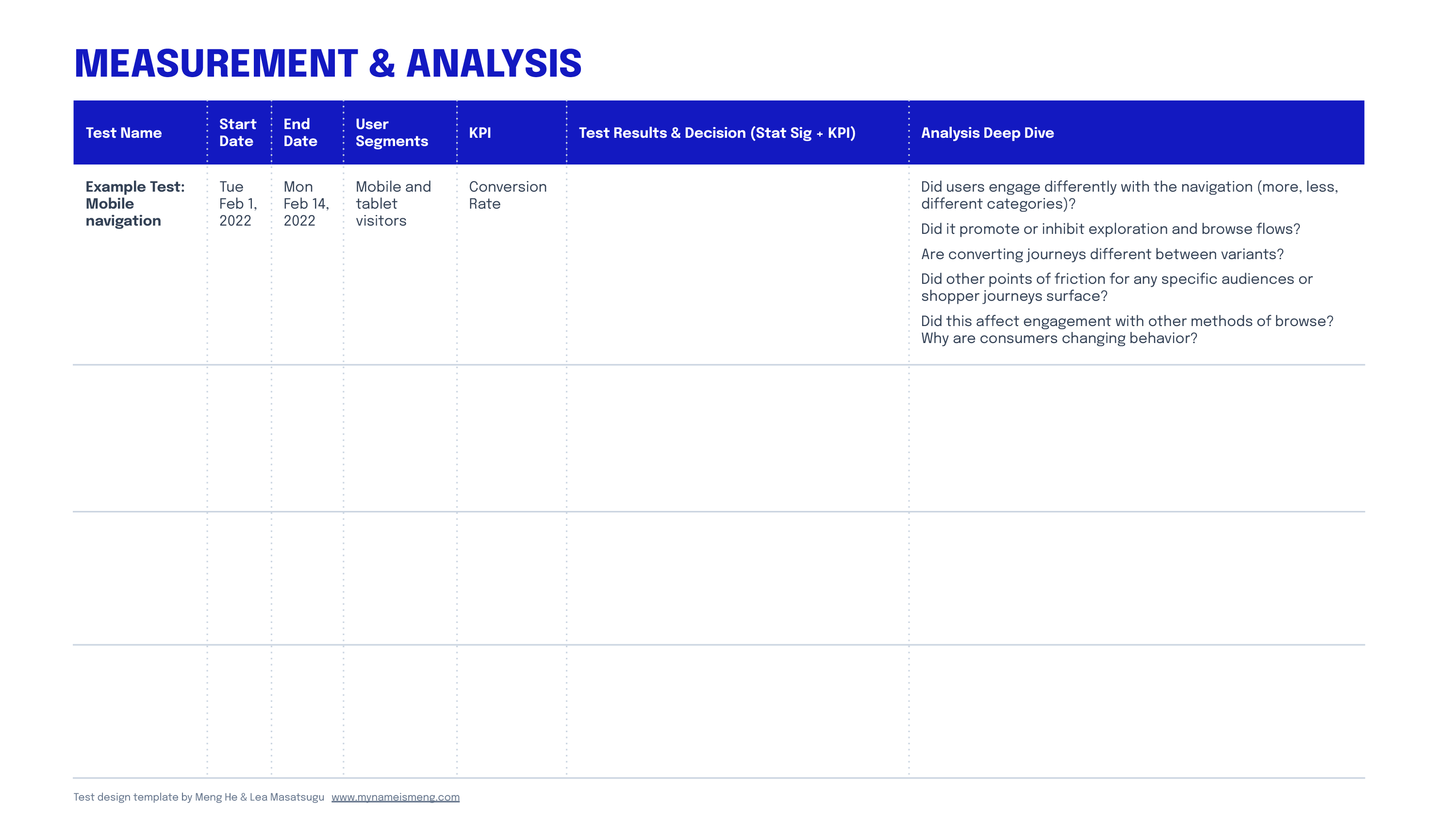
Measurement & Analysis
Before the test runs, complete a row to help yourself track the test and think through how you'll analyze the test results. Once results are in, where will you deep dive to unpack why this happened? What did you learn? How will you iterate? What is the next follow-on test based on your learnings here?
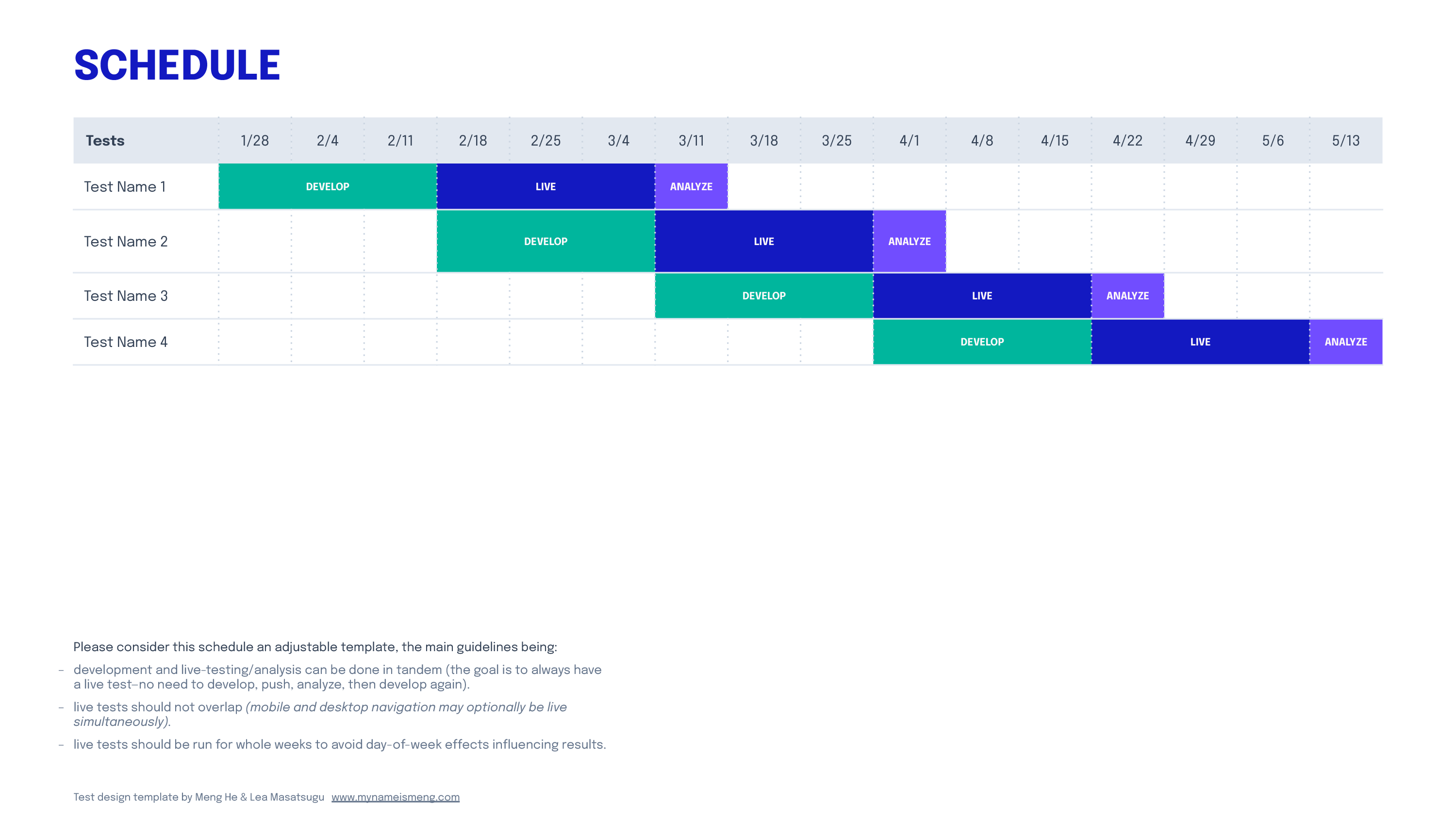
Development, Launch, and Analyze Schedule
To maintain momentum and ensure product, design, and engineering are aligned on scheduling, this planner helps you loosely sketch out a testing schedule so that no live tests overlap.
Each cell is a full week to avoid day-of-week effects influencing results (e.g. starting on a Monday and ending on a Friday may skew higher by avoiding the low-activity weekend). If a test requires more or less development, adjust the blocks as needed.
Development and live-testing/analysis can be done in tandem (the goal is to always have a live test to maintain momentum, and there's no need to develop, push, analyze, then develop again).
Although live tests should not overlap, mobile and desktop tests may optionally be live simultaneously if there's no crossover.
Test Design /
Example One
The company is a direct-to-consumer retailer that serves both a highly technical loyal customer base and growing a new segment of people who are curious to start this hobby and don't yet have the technical knowledge to make sense of a large catalogue of products.
ONE
Data & observations
- Affects only 10% of mobile traffic (desktop is similarly low at 13%)
- Although a similar volume of visits engaged with search across devices, mobile conversions from search is much lower than desktop, resulting in half the revenue on average.
- Where people search:
41% of searches start on product list pages
24% start on product pages
25% start on the homepage - Returning users are more likely to engage with on-site search (26% new vs 74% returning usage).
TWO
Interpretation & insights
- Shoppers may use search to bypass the header nav, especially to jump to a specific product or because they're unsure how to parse the complex information architecture in the header nav.
- Low engagement from new visitors may indicate on-site search isn’t friendly to them (especially if they're unfamiliar with the technical specifications of the products).
- Potentially, people might not be ready to buy on mobile and are just exploring their options (data observations account for media mix), but could also signify a issue with the mobile search experience.
- If we could improve their search experience by connecting them to the right products and minimize confusion with layers of unnecessary technical information, aspirational browsers may feel confidence in converting.
THREE
Hypothesis
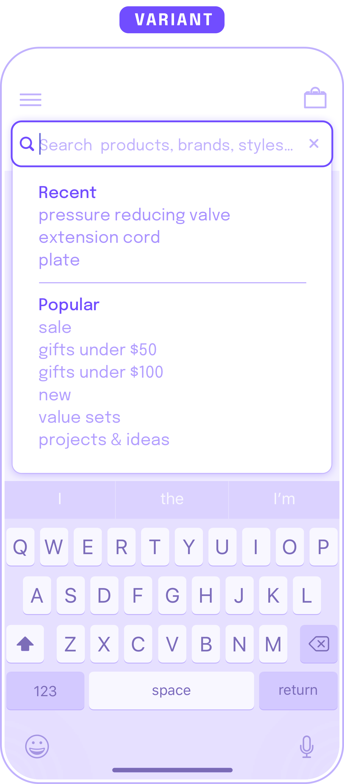
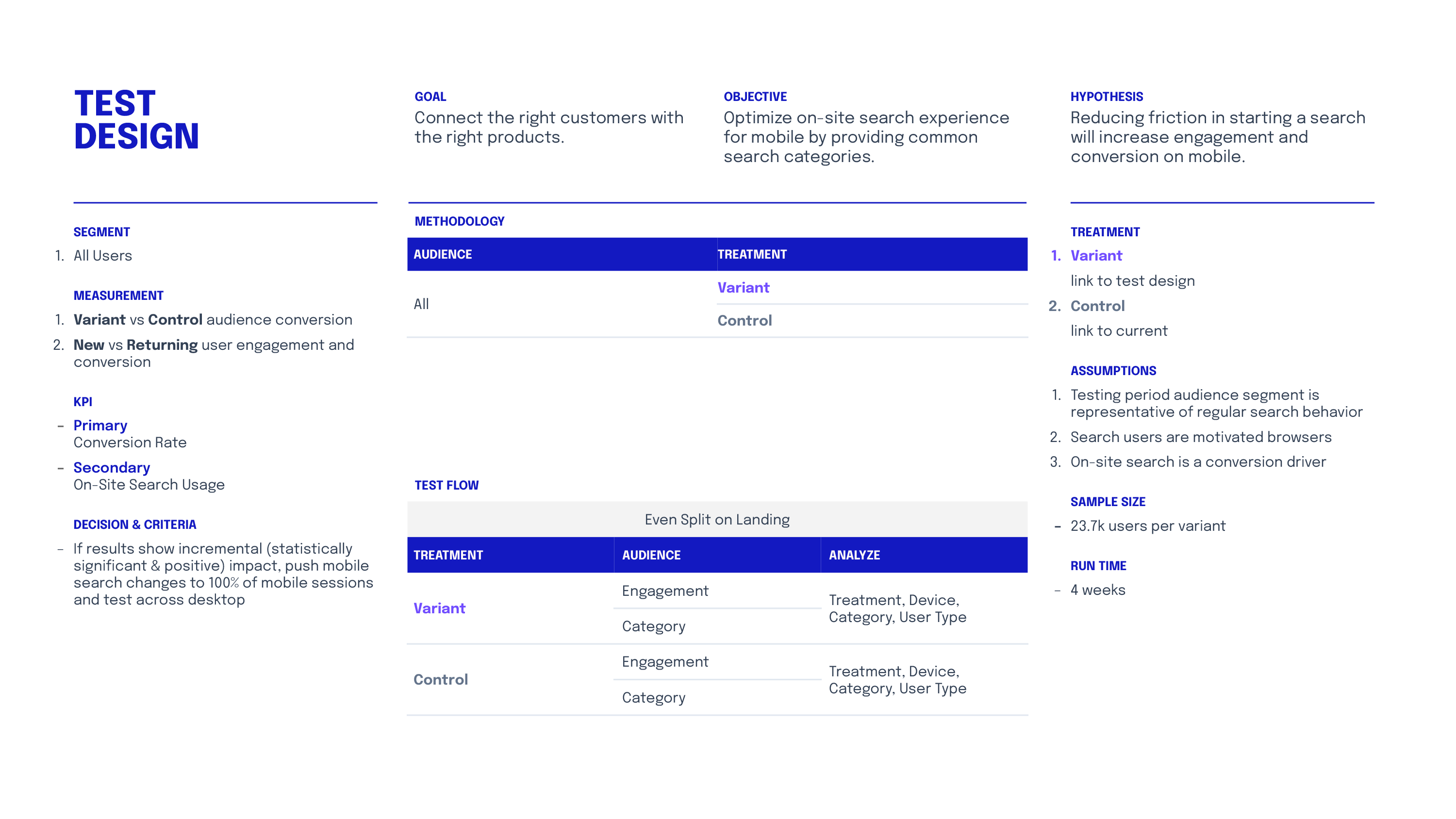
- Reducing friction in starting a search will increase engagement and conversion on mobile. Test showing an interactive menu on click, displaying both recent searches and popular searches.
FOUR
Design to test
- The current search design is an empty search box with no feedback until the shopper searches for a term.
- Recent searches
Helps shoppers pick up where they left off, in case they've now reached a purchase decision. This saves them from typing on mobile, and reminds them of their previous high-intent searches. - Popular searches
Pick out relevant jumping-off points (categories, top searches, seasonal keywords). Potentially more useful than listing just categories, and demonstrates social proof for discovery.
This can be manually seeded to start, and conduct additional tests on how customers interact with this menu to further refine and augment the top nav for browse. - Possible follow-on test design:
Actual top searches compared to a repeat of the header navigation items compared to control.

Test Design /
Example Two
The company is a direct-to-consumer retailer who recently began focusing on mobile experience after more traffic shifted to mobile. Some features added are unique to the mobile experience, such as this "product added" modal.
ONE
Data & observations
- 75% of mobile users tend to go to cart or checkout via the "product added" modal that displays after every add-to-cart interaction (this modal is only displayed on mobile).
- The average number of SKUs per mobile order is 3.
- Mobile transactions with 1 SKU per basket make up 27% of orders, 2+ SKU orders make up 73% of orders.
- Orders with 2+ SKUs have on average include lower value items (<$25 average item value).
- Over 90% of orders meet the free shipping minimum.
TWO
Interpretation & insights
- Shoppers are being sent to cart/checkout before they are done shopping.
This may indicate the size of modal and available links may be adding extra steps and friction instead of streamlining their shopping experience.
Shoppers may be adding more to basket to help meet minimum shipping requirement.
THREE
Hypothesis
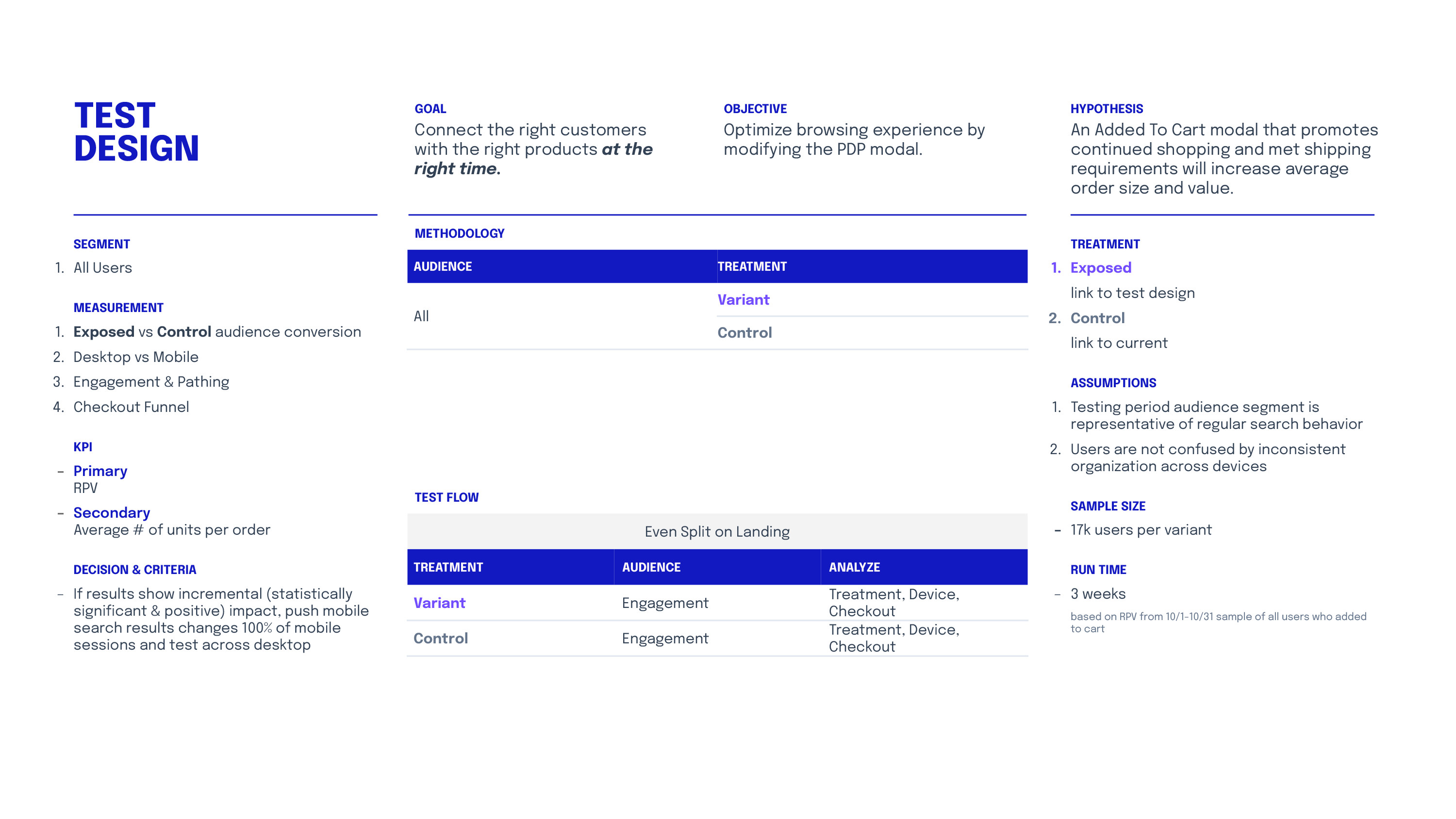
- An added to cart modal that promotes continued shopping and met shipping requirements will increase average order size and value.
FOUR
Design to test
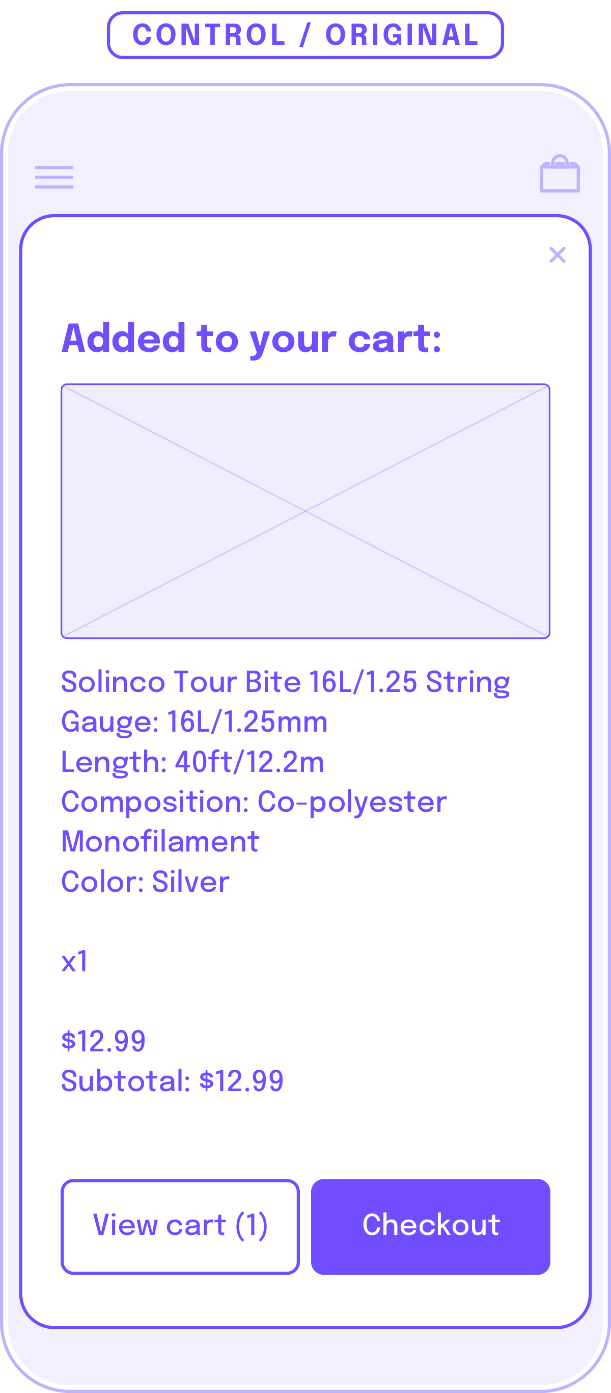
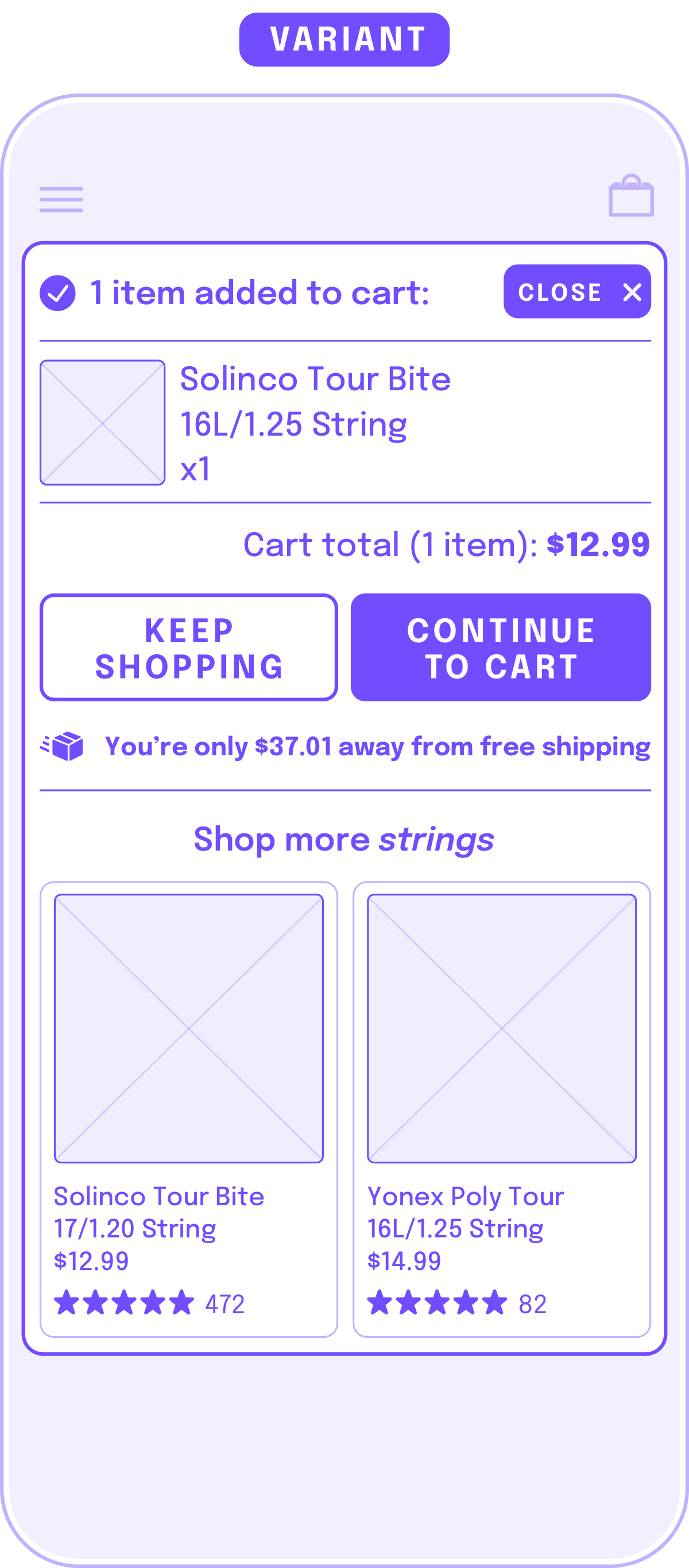
- The original design shows extensive details on the product the shopper has just added to cart, which accomplishes two things: 1. allows shopper to check for accuracy, 2. provide positive feedback on a successful add-to-cart action. To continue shopping,
- Condensed description
Information about the product that was just added is condensed to allow the customer to accomplish the two goals above. - Almost equal weight for shop more and enter checkout flow
"Keep Shopping" and the close button closes this modal so the shopper can return to the product detail page where they left off.
"Continue to Cart" was chosen over "Checkout" for the less aggressive wording and to help shoppers feel in control of the next step (review their cart) rather than potentially being rushed into a payment flow. - Shop More "Category"
Use the same product tile component (taken from the product list page) here to facilitate browsing to help reach free shipping minimum and inspire higher order value. Products can be seeded from the same product category for now to speed execution (using the breadcrumb IA). - Analyze how shoppers interact with the "Keep shopping" products. Products in the same category may not be appropriate / helpful to show, and may be worth experimenting with a third-party smart recommendations engine to encourage add-on products that are complementary to the just-added product, rather than only products in the same category.
Test Design /
Example Three
The company is a direct-to-consumer retailer that sells a wide assortment of products in many categories.
ONE
Data & observations
- 85% drop-off on product detail page (PDP) landing significantly higher than any other type of landing page.
- 34% use PDP breadcrumb (when it exists) to navigate back to the product list page.
- When the PDP is the landing page, conversion rate, page views per session, and session
duration are all significantly lower (all traffic and organic consistently low across the board, meaning it's not a
traffic mix or inventory issue). This drop-off is consistent across a wide range of categories and products.
TWO
Interpretation & insights
- Users landing on PDP aren’t sure of (and/or aren’t inspired by) what to do next.
- Converting user flows show that most users navigate to a product list page from PDP to continue browsing.
- People are landing on a product that’s close, but may not be the exact product they’re looking for (perhaps a limit by the referring channel). They may want to see the range before committing (it’s fun to browse to make sure I’m getting the best option).
THREE
Hypothesis
- Promoting cross-navigation on PDP will encourage entry users to continue exploring.
FOUR
Design to test
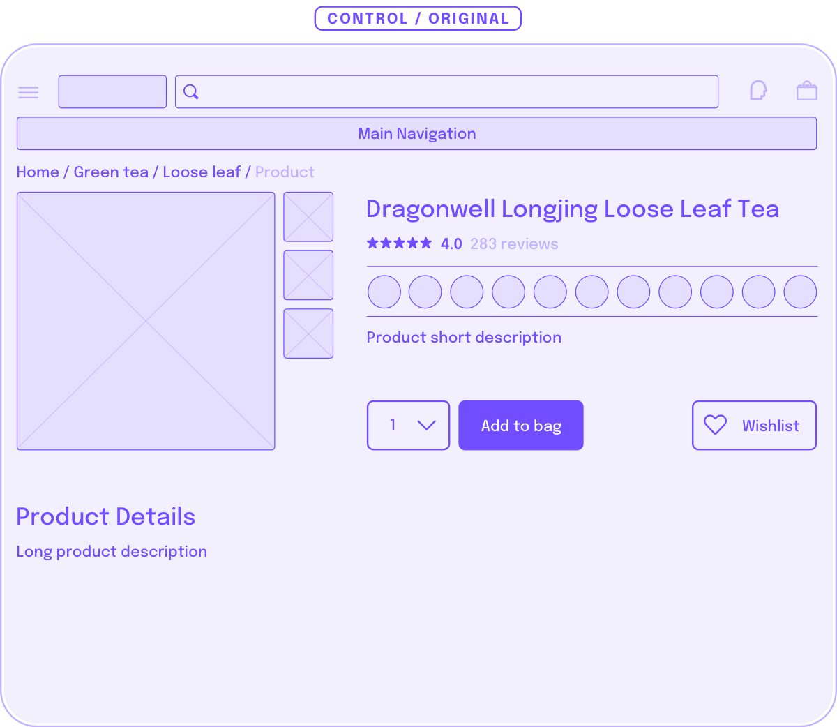
Control, keeping the PDP exactly as is.
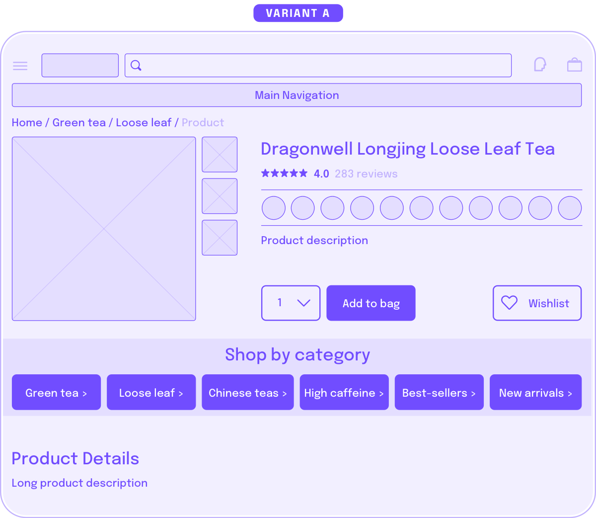
Category-specific category tiles to help people who want to stay nearby.
Hypothesis:
People are landing on a product that’s close, but it may not be the exact product they’re looking for, or they may want to assess all of their options in the range before committing
Execution:
Use breadcrumb information architecture to inform categories displayed.
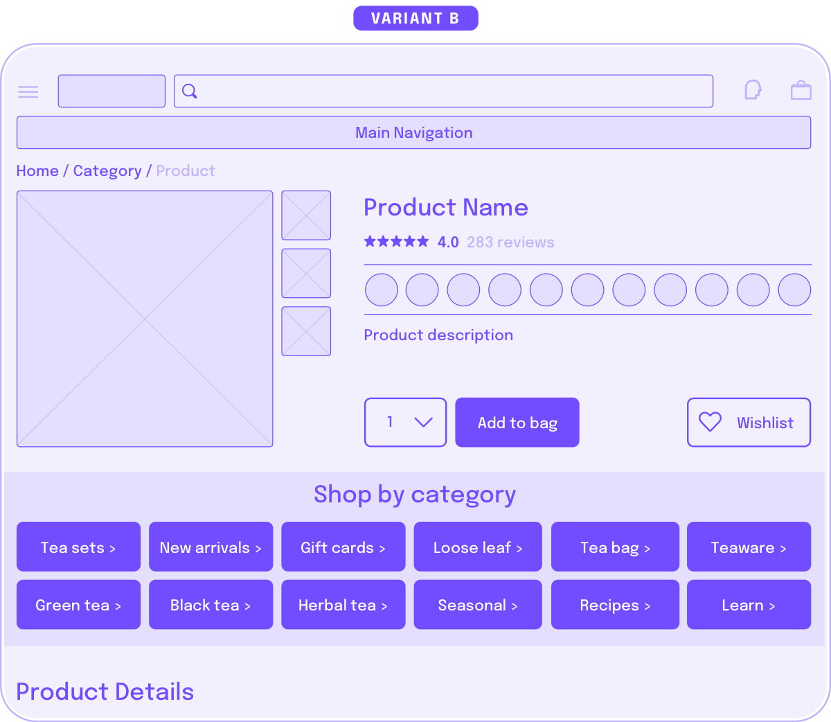
Quickly launch into the most popular or interesting sections of the site to inspire more browsing and capture/shape intent.
Hypothesis:
Customers may not have a specific intent and general hooks may inspire additional browsing or discovery. These customer may be more suggestible and not on a specific journey.
Execution:
Use general navigation categories.
In conclusion
We hope this structure and examples help you in your testing journey.
Questions? Ideas? Feedback? Let us know how you've been using this workbook with your company on Twitter: @menghe

Get the FREE Google Slides template
Get the FREE Google Slides template
Use our template to help design your A/B tests, organize your analysis, and schedule each release.
Use our template to help design your A/B tests, organize your analysis, and schedule each release.
Credits
Thank you Lea Masatsugu, Maya Bhat, and Dana Lee for all you've taught me about analytics and asking the right questions, and mostly for always finding time to partner with me — none of this would be possible without you.
