Mētō is a tech-based nonprofit on a mission to make access to quality higher education a reality for all students in Africa.
WHAT IS METO?
Every year, 20 million African students graduate from high school, yet only 1 in 10 continue into higher education. Universities around the world would love to recruit these talented students, but therein lies an information gap. Only a tiny fraction of these students have the resources to even discover these international universities that are an academic, financial, and extracurricular fit. For universities, these students are difficult to reach and recruit.
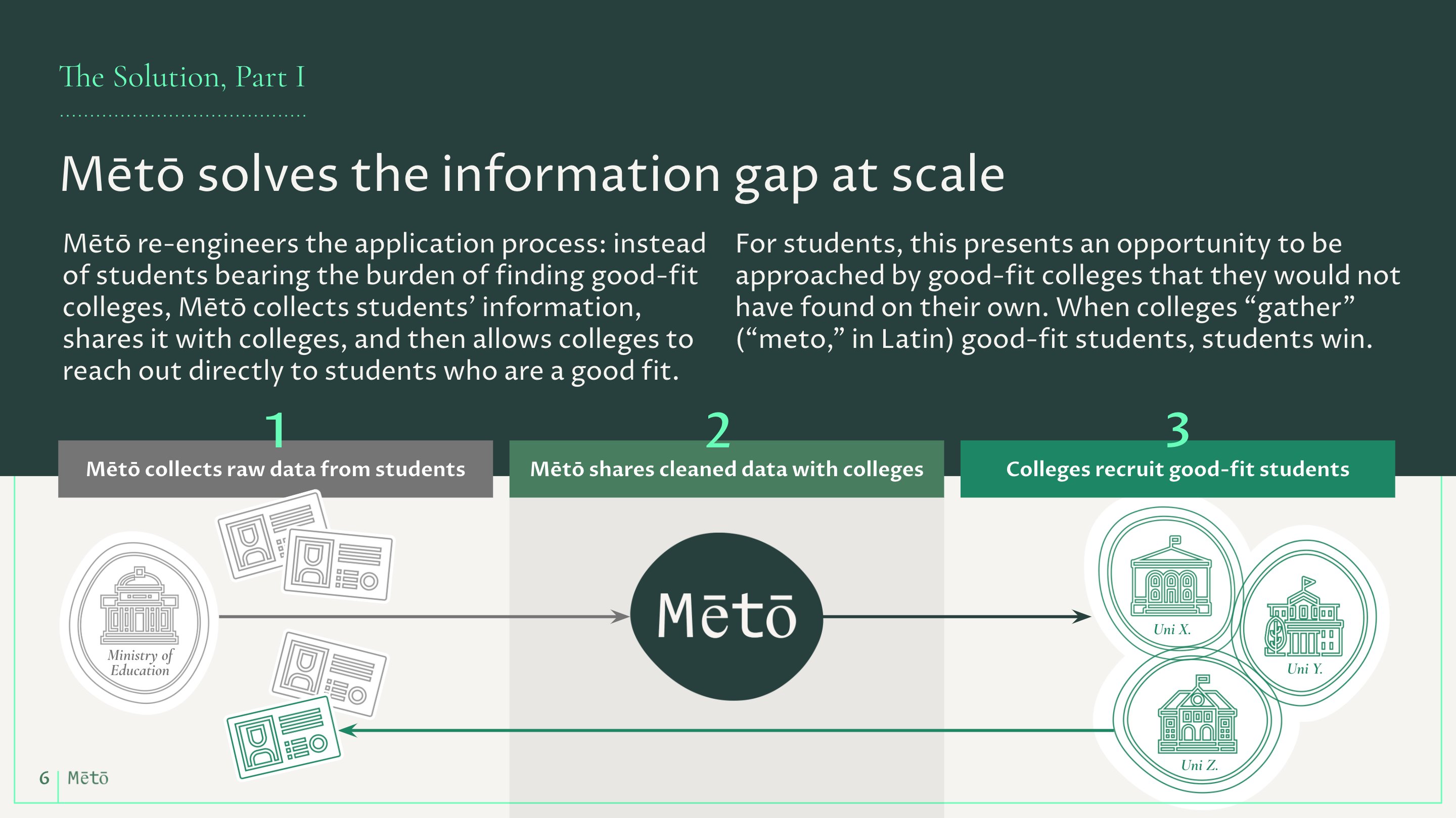
Founder Ryan Benitez founded Meto to solve this information gap at scale by collecting student information from high school, ministries of education, and students themselves. This information is organized and shared in a searchable way with universities around the world, who then reach out to students who are already a preliminary match. As a result, students can apply to fewer schools and face less disappointment in the otherwise confusing, time-consuming, and expensive college application process.
GOALS
Emphasize that Meto is a modern tech solution that's designed to scale.
Inspire several disparate audiences to action—students to join, high schools and universities to participate, ministries to share information, investors and individuals to support the mission.
DELIVERABLES
Fundraising presentation,
responsive website design, and
Wordpress development
FUNDRAISING PRESENTATION
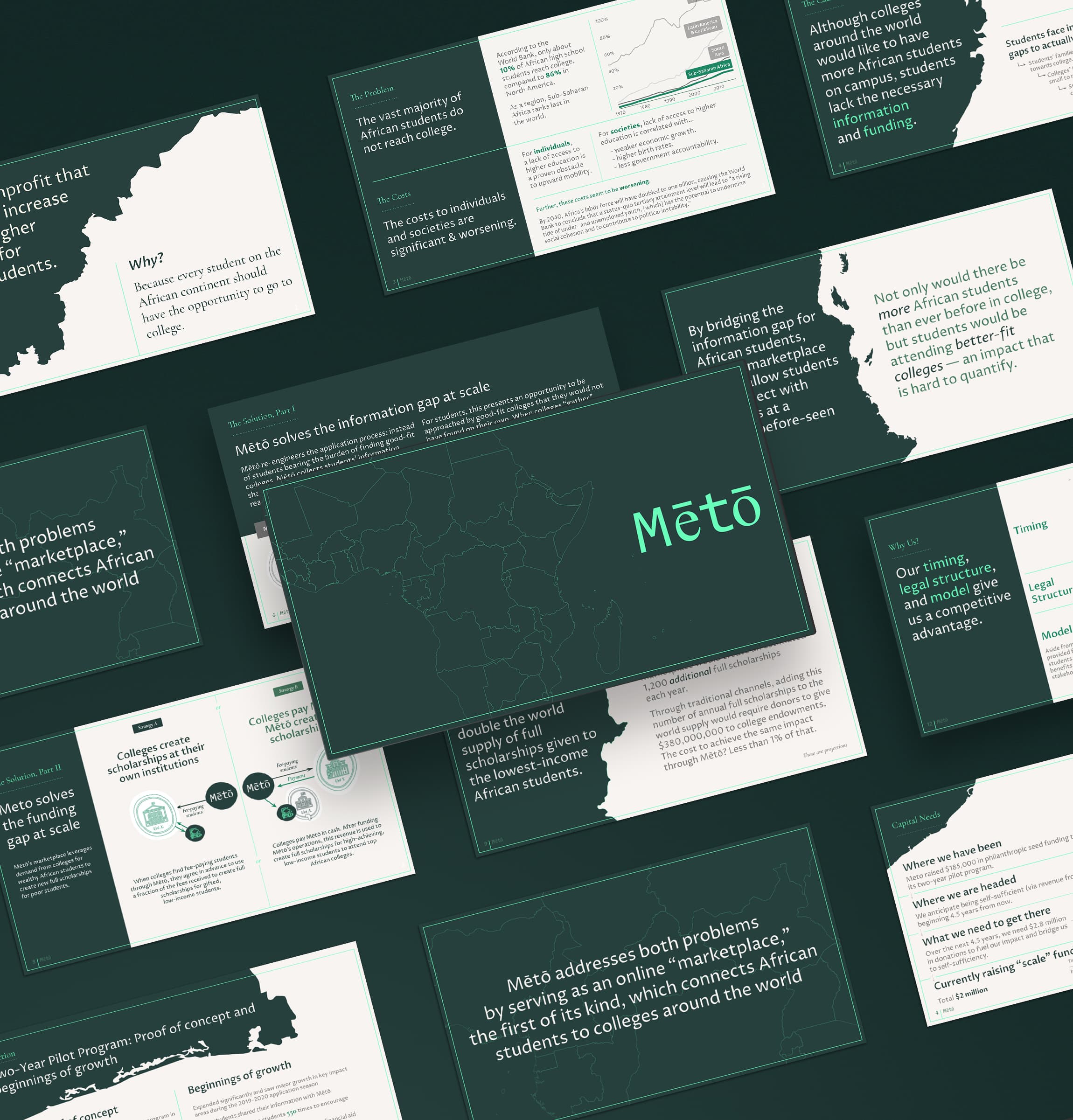
Our first project was to create a cohesive visual brand identity for an investor presentation in Google Slides. Ryan had already tested and iterated on the content and narrative to effectively communicate his vision and strategy—so design's job is now to help convey the intangibles: the team's professionalism, hard work, and dedication to realizing this vision.
DESIGNED TO SCALE
Just like how Meto is solving the education and information gap at scale, design is only successful if the solution can be maintained and scaled by the team—even if they don't have an in-house designer.
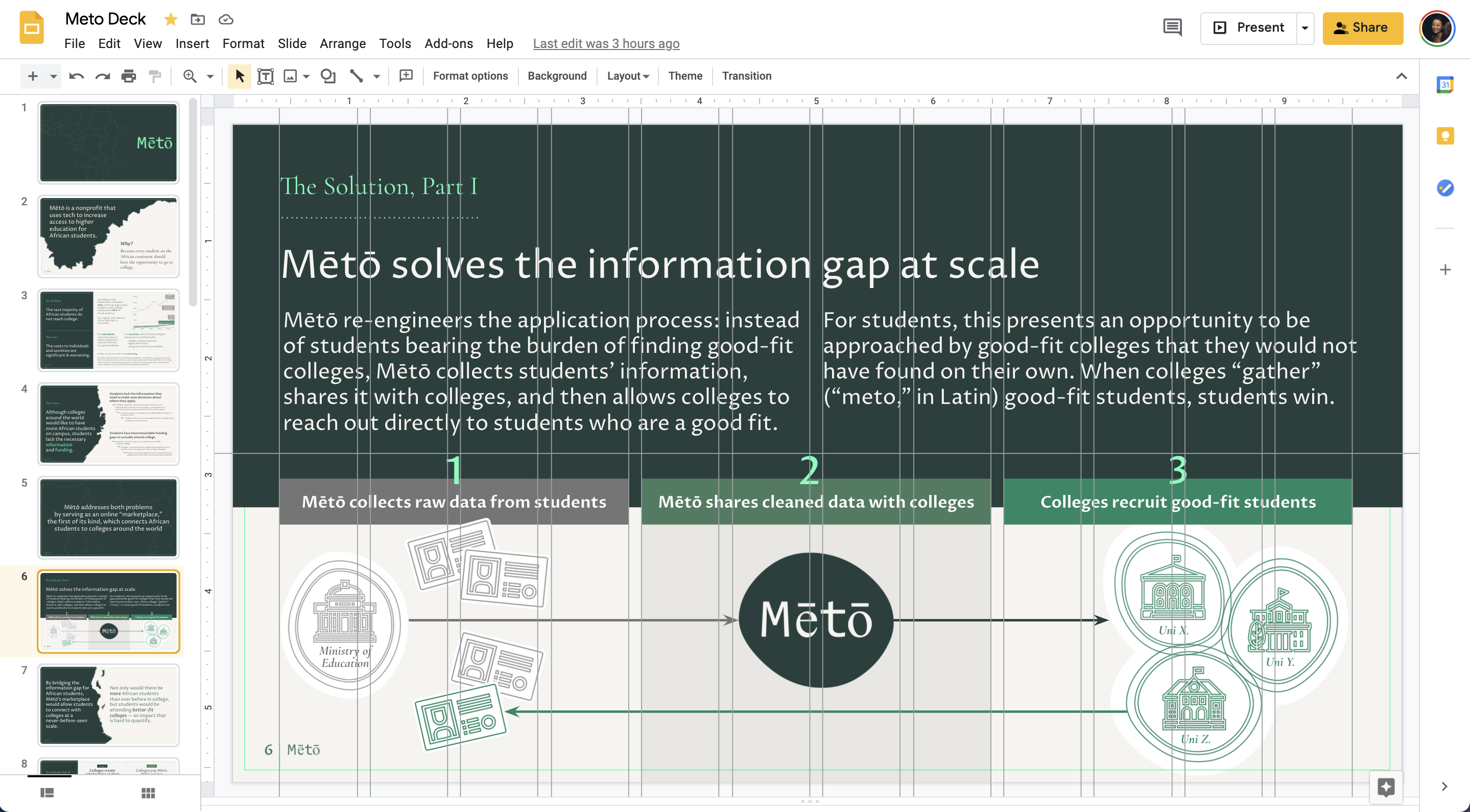
With that in mind, grids, colors, slide backgrounds, and text styles are set up to demystify the design process—slides should continue looking polished as long as images and text align to the grid.
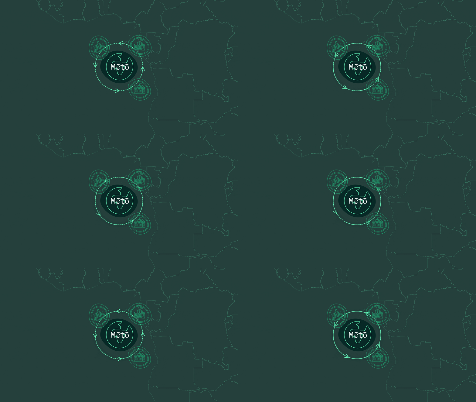
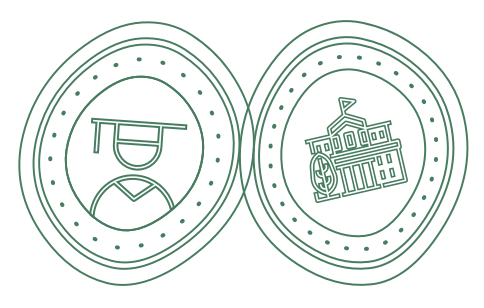
Reusable components (map pieces, custom iconography) can be re-arranged like puzzle pieces to help to illustrate a myriad concepts now and in the future.
TYPOGRAPHY
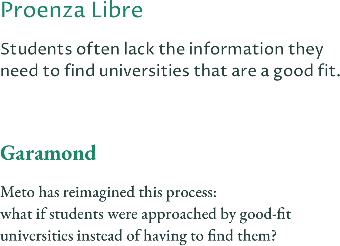
Garamond is the secondary typeface, chosen as a serif partner to Proza Libre. Garamond is a great partner for many reasons: they share the same DNA (Proza is partly inspired by Garamond and Jenson), it's widely used in book publishing (helping the brand appear distinguished and established, with a nod to education), and it's a workhorse of a typeface with a large family of font weights, glyphs, and variations—important for an international organization like Meto.
COLOR
Meto is "gather" in Latin—"When universities gather students, students win." Inspired by Ryan's suggestion that the branding center around agriculture, we developed a palette ranging from dark forest green to highlighter green, which lends the brand a modern tech pop of contrast. Creamy warm grays soften the grayscale for backgrounds and text.

PRESENTATION DECK
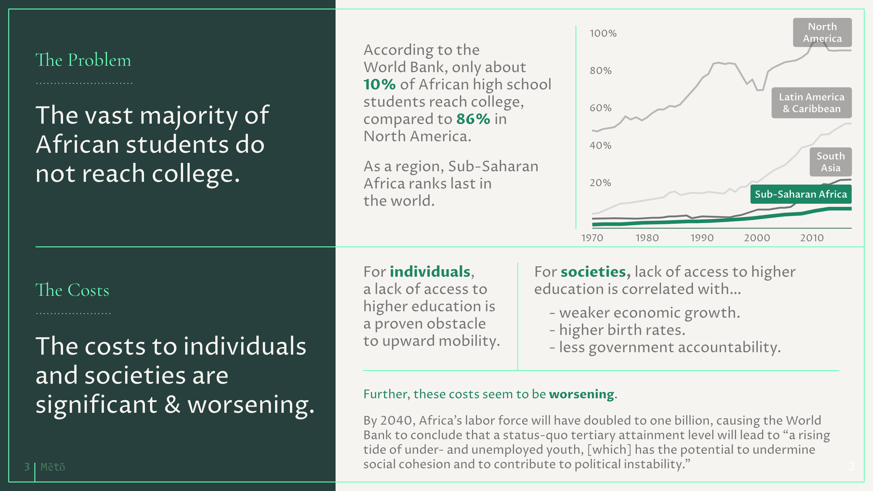
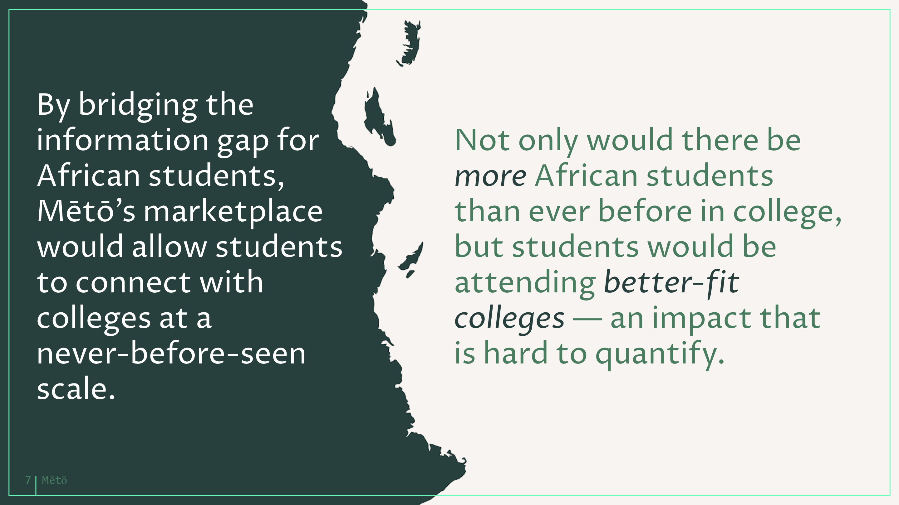
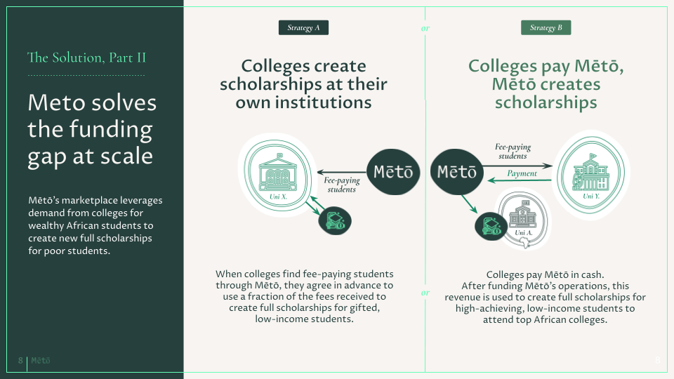
A selection of slides from the 20-page Google Slides presentation.
WEBSITE
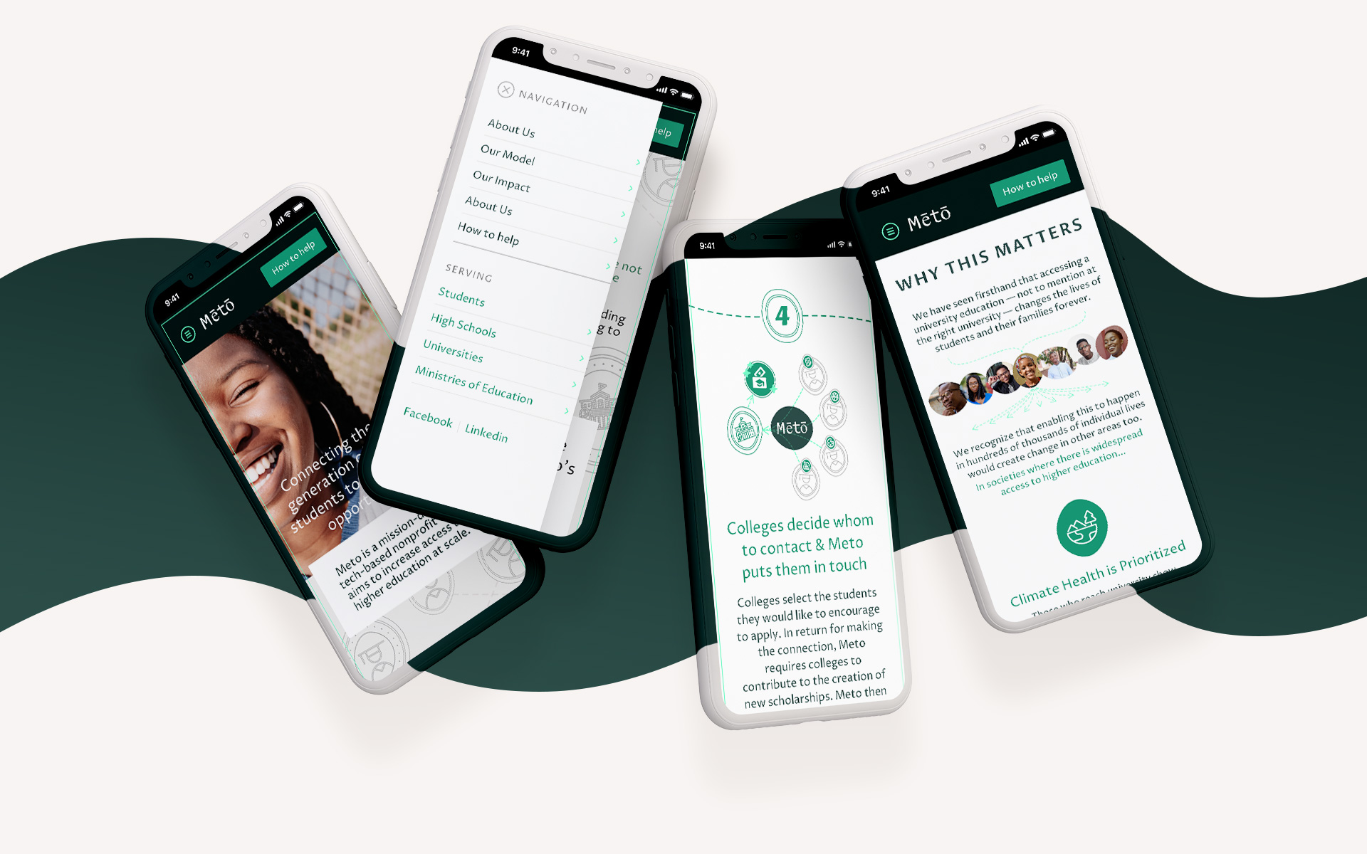
Next, we turned our effort to update the public-facing touchpoints of Meto by applying the same storytelling and visual identity to the website. This is where students, universities, high school counselors, ministries of education, and donors all land to learn more.
Two things I've learned over the years while working as a consultant: show work early & often, and momentum matters. When going to 0 to 1, the easiest way to get over that initial blank page rut is to get something imperfect down on paper, see how it feels, then edit and refine from there.
We started with brainstorming the goals Ryan hoped to achieve with the site. Who were the target audiences? If we were successful, what do we hope each of these audiences will achieve from their visit? Working backwards from these goals as a north star, this document became our roadmap for the content strategy.
From here, Ryan began writing content in a Google Doc while I started translating his written words into artboards in Sketch, syncing the prototype to InVision. Just like "stim" in a co-creation session, seeing and interacting with a prototype can lend a fresh perspective and reveal opportunities. A narrative that felt clear in a linear document may not translate well to how people use a website. Showing other stakeholders early also illuminated gaps and new perspectives.
Patterns emerge where calls-to-action that drive impact became a repeated pattern across pages.
Pages that felt overloaded with long or dense information got infographics or spun out into their own pages. A paragraph becomes a bulleted list, each illustrated with an explanatory infographic for scannability. A longer page targeting multiple personas becomes 4 distinct landing pages—one for each target audience.
Building this site was a truly collaborative experience—with voice memos, sketches, and notes flying back and forth. And to today, it's still a living organism that's continuing to evolve as needed.
Rather than facing pressure of perfecting content in a phase completely divorced from design, working hand-in-hand is critical in achieving successful outcomes. No matter how experienced someone might be, design and storytelling is always a process of experimentation, and never a straight line.


"
Meng's design skills are simply outstanding -- the design she created for Meto is far better than anything I could have imagined. However, what really sets her apart is that she also possesses an uncanny ability to make design decisions understandable to someone like me, who has no design experience. With great confidence and humility, Meng walked me through the design process, and the end result shows how well she walked the line: Meto's online presence displays Meng's skill but my vision for the organization.
— Ryan Benitez, Founder & CEO
"
CREDITS
Logo, copy, and direction by Ryan Benitez and Blake Thomsen
Visual identity, web design, web development by Meng He
